The Top 5 States data transform that you created earlier contains a dynamic sub-set of the original states data. You will use this to produce a bar chart visualization.
Perform the following steps to create the bar chart visualization:
- Click
 .
.
The getting_started connection, the states feed, the region_summary transform, the Top 5 States filter transform, and the State Summary visualization are displayed in the pipeline. - Click the gear icon button in the Top 5 States transform box.
- Select +, and then New Visualization.
A pop-up for choosing a visualization is displayed. - In the pop-up, select Chart.
A new page is displayed. - On the Base Chart tab, do the following:
a) In Visualization Name, enter Top 5 States.
b) For Default Type, select bar.
c) Click Next.
You are taken to the Dimensions tab. - On the Dimensions tab, do the following:
a) Make sure category is selected for Type.
b) For Attribute, select State.
c) Click Next.
You are taken to the Measures tab. - On the Measures tab, do the following:
a) Make sure linear is selected for Type.
b) Leave all default values as they are.
c) Click Next.
You are taken to the Series tab. - On the Series tab, do the following:
a) Make sure the Atrribute Name is TotalSales.
b) In Renderer, click on the pencil icon to access the editor.
– In the pop-up, select green for Color, and Gradient for Fill.
– Save your changes.
c) Click Next.
You are taken to the Preview tab where you can observe the bar chart showing the total sales for the top 5 states. - Click Save and Close.
The Top 5 States bar chart visualization is displayed in the pipeline.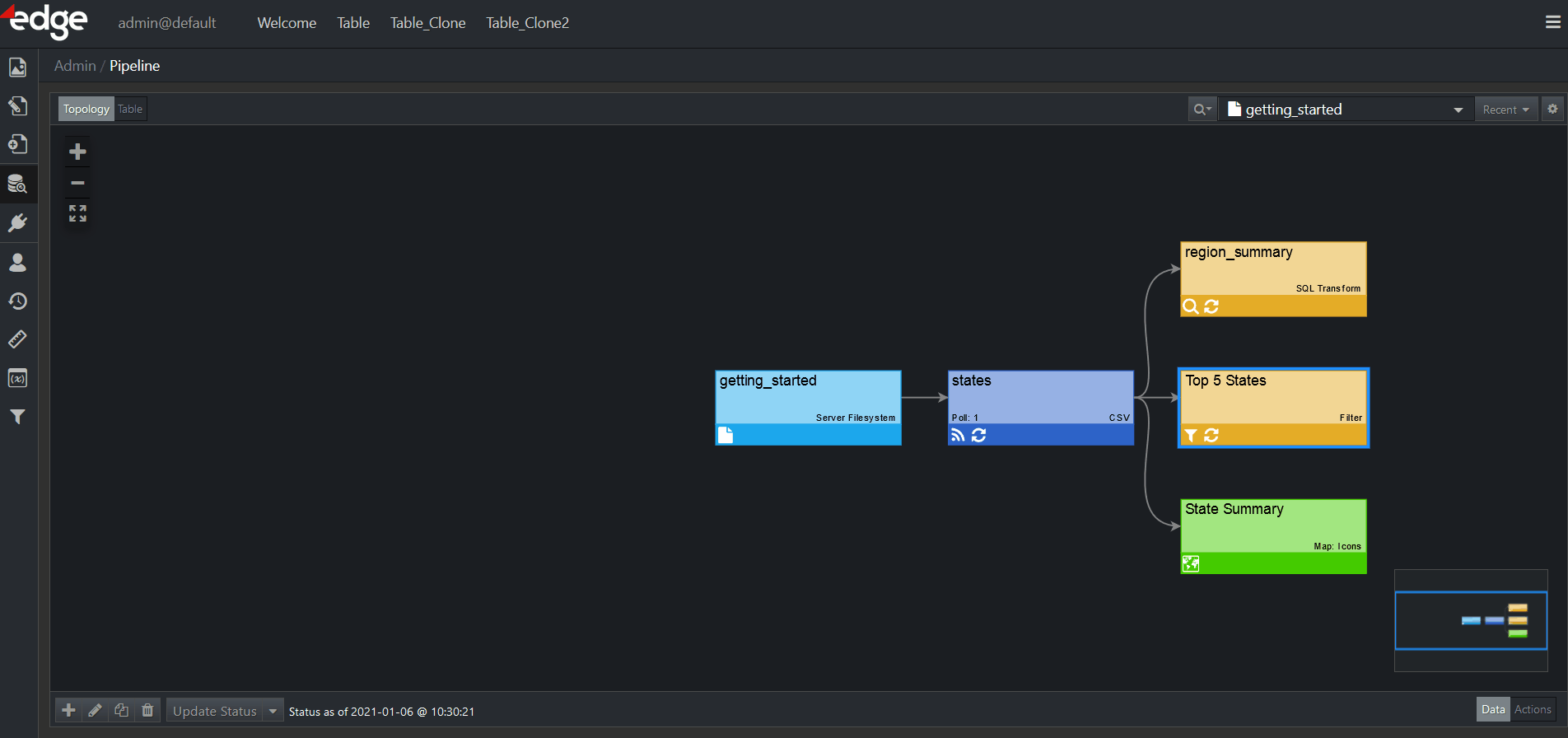
For more information on Visualizations, refer to the corresponding chapter.
Additionally, if you want to learn about custom visualizations, you may do so here.