★ Note: A new Visualization type, called Bullet Chart, was first included in edgeCore v3.5. It has many similarities to the Linear Gauge Visualization. For more information on the Bullet Chart Visualization, see Bullet Chart.
The following documentation is for the updated Gauge Visualization in edgeCore v3.5 and higher. If you are using an edgeCore version prior to v3.5, see Legacy Gauge Visualization. ⚠ Note: Thresholds and Comparative Values are no longer supported.
Specifically, the Linear Gauge Visualization from a pre-v3.5 system is not compatible with the current Linear Horizontal Gauge. Any older Liner Gauge Visualization should be reviewed when you are upgrading to v3.5 or higher. It might have to be manually converted to a Bullet Chart Visualization.
Gauge Visualization
This section contains details on how to configure the Gauge Visualization in edgeCore v3.5 or higher.
Overview
The Gauge Visualization displays one or more values, along with any number of attributes/icons.
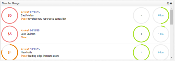
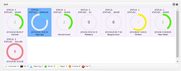
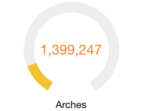
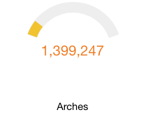
Arc Gauge
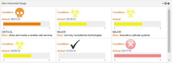
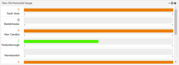
Linear Horizontal Gauge
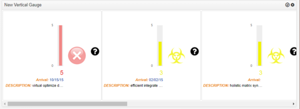
Linear Vertical Gauge
Gauge Configuration Steps
The Gauge Visualization configuration is broken out into five steps:
- Base Gauge
Identifies the name and appearance of the Visualization. - Renderers
Configures where and how labels, values, icons, and gauges will appear. - Options
Determines some additional options based on the type of gauge. - Sort
Determines the default sort for the gauge. - Preview
Preview of the gauges based on the choices made.
Step 1: Base Gauge
Visualization Name
A symbolic name used to represent this Visualization. This is the name that will show up in choosers when adding a Visualization to a page.
Type
The type of gauge. Choices are:
| Arc | Gauges are radial |
| Linear – Horizontal | Gauges are horizontal. |
| Linear – Vertical | Gauges are vertical. |
List Orientation
The type of layout. Choices are:
| flow | Flow layout produces a horizontal list. List items will have a set width, and flow left to right. List items will wrap to the next line if needed. |
| horizontal | Similar to a flow layout. List items will have a set width, and flow left to right. List items will not wrap and will scroll horizontal if needed. |
| vertical | Vertical layout produces a vertical list. This list will render a single record per row, and each row will fill 100% of the available space. |
Padding
Number of pixels between the list item and its border.
| Min | 1 |
| Max | 60 |
Margin
Number of pixels between list items. Not applicable in vertical list orientation.
| Min | 1 |
| Max | 40 |
List Item Width
Determines width of each list item in flow or horizontal list orientation.
| Min | 120 |
| Max | 700 |
Show Border
Determines whether a border will appear for each item in a flow or horizontal list orientation.
| Yes | A border will appear around gauges |
| No | Gauges will not have a border |
Gauge Size
Determines the size of the arc gauge.
| Min | 60 |
| Max | 1024 |
Gauge Spacing
Determines the distance in pixels between the outer edge of the chart (Gauge Size) and the content. The numbers designate top, right, bottom, and left respectively. If the start or end point label is cut off, consider adding a little padding. For example 0,10,10,5.
Gauge Length
Determines the length of the linear gauge.
| Min | 60 |
| Max | 1024 |
Gauge Width
Determines the width of each linear gauge – combine width of axis label and the bar.
| Min | 25 |
| Max | 256 |
Auto-expand
This property is available with “Flow” list orientation. It works in conjunction with list item width, and determines whether list items should grow to fill any remaining space. This option basically turns the list item width property into a Min-Width property.When using flow list orientation layout with auto-expand enabled, a list item’s width will grow to fill available space until there is enough room for another minimum width list item to appear. When that happens, a new list item will appear on the row, increasing the number of items on that row. All list items will then snap back to their configured widths and will grow as needed until there is room for another item.
Item Background Color
Determines the background color of each item.
Step 2: Renderers
This step configures the attributes to display as part of each list item. It also defines the renderer to use when presenting the values for the specified attributes.
Attribute Name
Determines the record values that will appear in each list item.
Label?
This property determines whether a label will appear next to a value within a list item.
| Yes | A label will be shown to the left of the value. |
| No | Only the value will be shown. |
Display Name
Label acts as a description for values that appear in a list. The Label defaults to the Attribute Name, but can be overwritten with something better optimized for display.
Renderer
Determines the renderer to use with the associated attribute. The value renderer determines how record values for each attribute are presented. The available renderers will vary based on the data type of each attribute.
- Icon
- Number
- Text
- Date
- Gauge
See Renderers for more information.
Label Formatter
Determines how labels will appear inside list items. The label formatter is a global setting, and will be used for all labels within the List.
Color
Determines the color of labels. See Color Picker
Size
Determines the font size of labels.
| Min | 6 |
| Max | 256 |
Style
Determines the font style of labels.
| Normal | Sample |
| Italic | Sample |
| Bold | Sample |
| Bold Italic | Sample |
Step 3: Options
The options properties displayed depend on the type of gauge selected.
Value Strategy
Minimum Strategy
Configure what the minimum value will be shown on the axis of the chart.
| Static | Type in a value that will be used to set the minimum value of the chart’s axis. |
| Calculated | Automatically calculate an appropriate minimum value of the chart. |
| From Field | Choose a field in the data that will set the minimum value on each chart. |
Maximum Strategy
Configure what the maximum value will be shown on the axis of the chart.
| Static | Type in a value that will be used to set the maximum value of the chart’s axis. |
| Calculated | Automatically calculate an appropriate maximum value of the chart. |
| From Field | Choose a field in the data that will set the maximum value on each chart. |
Additional Options
Inline Content Alignment
By default all non-icon and gauge items will be part of inline content, which property controls how these items are aligned within its container.
| center | Item will be center aligned. |
| left | Item will be left aligned. |
| right | Item will be right aligned. |
Arc Gauge Options
Arc Thickness
Determines the thickness of the Arc. The four options are:
- Thicker
- Thick
- Thin
- Thinner
Arc Start Angle
Determines where the gauge value starts
| Default Value | 0 |
Arc End Angle
Determines where the gauge value ends
| Default Value | 360 |
Start and End Example 1
| Start Angle | -150 |
| End Angle | 150 |
Start and End Example 2
| Start Angle | -50 |
| End Angle | 50 |
Legacy Linear Horizontal Gauge
The following setting will be shown if there is only one Gauge renderer, it is not rendered as part of inline content, and list orientation is vertical. This is to support the upgrade of pre-3.5 version of Linear Gauge. User should consider convert this to a Bullet Chart or adjust the chart’s setting to avoid using legacy rendering which will be discontinued in the near future.
Show as Legacy Linear Gauge
Determines whether to show a comparative measure on the linear gauge, indicated by a vertical line.
| Yes | Deprecated. This is to replicate pre 3.5 version of Linear Gauge where the gauge auto expand horizontally to the available width in a vertical list layout. The label and value column is restricted to a fixed width. |
| No | Turn off legacy linear gauge rendering style. |
Inline Content Fixed Width
Deprecated. The width of the label and value column.
| Min | 40 |
| Max | N/A |
Setting Dual Color Gauge and Defining Threshold
edgeCore version: 4.3.11-hotfix3
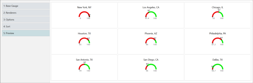
Setting a second color for the gauge and defining a threshold value is done in the Renderers tab when configuring a gauge visualization.
Example:
We have uploaded a CSV file containing the following data:
| Rank|NUMBER | City|STRING | Population|NUMBER |
| 1 | New York, NY | 100 |
| 2 | Los Angeles, CA | 95.4 |
| 3 | Chicago, IL | 93 |
| 4 | Houston, TX | 85 |
| 5 | Phoenix, AZ | 86 |
| 6 | Philadelphia, PA | 87.2 |
| 7 | San Antonio, TX | 94 |
| 8 | San Diego, CA | 96 |
| 9 | Dallas, TX | 96.7 |
When configuring the gauge visualization, we are going to take the following steps:
- Provide a name for the visualization.
- Set the List Item Width to 300.
- In the Renderers tab:
a) Click + to add attributes to the gauge. We are going to add City and Population as seen in the CSV data above.
b) (Optional) Disable the Label? toggle for attributes if you do not want the labels to be displayed.
c) For the Population attribute, in the Renderer dropdown, select Gauge, and then click the pencil icon next to it. A pop-up will be displayed.
d) In the pop-up:
– Enable the Dual Color Gauge toggle switch. Gauge Second Color section will be displayed.
– In the first Gauge Color, set the color (for example, red) and enable Set To Value. The To Value field is displayed, where you should set the value (for example, our value is 97).
– In Gauge Second Color, set the color (for example, we set it to green) and enable Set From Value. The From Value field is displayed, so you should set the value (here we are also going to input 97).
– (Optional) Enable Show Label if you want to see the threshold of the value.
– Click Save. - In the Options tab:
a) In the Value Strategy section, set the Minimum Strategy to From Field. In our case, we will set the Attribute to Population. You can leave the Maximum Strategy as is.
b) In Additional Options, adjust the Arc Start/End Angle. We are going to set the Start Angle to -90 and the End Angle to 90. - Go to the Preview to view the end result.
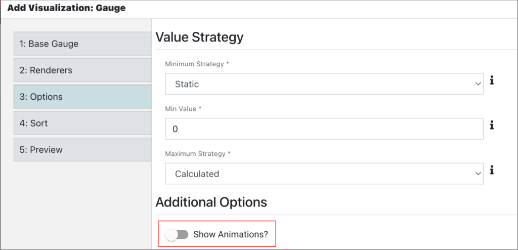
Disabling Animation
edgeCore version: 4.4.1
Disabling animation in a gauge is done in the Options tab > Additional Options.
The Show Animations? toggle switch is enabled by default. If you do not want to have animation, turn off this toggle. In the following screenshot, we have disabled this option: