edgeCore version: 4.7.0
Overview
Funnel chart visualization depicts values across multiple stages in a process and the overall decrease of each step. This type of visualization is wide at the top and becomes narrower until it reaches the bottom.
Funnel charts are often used in marketing or sales. For example, you might use this type of chart to:
- track how a starting set of visitors drop out of a flow
- show potential revenue for each stage in a sales process
- display the number of sales prospects at each stage in a sales process
- track website visits
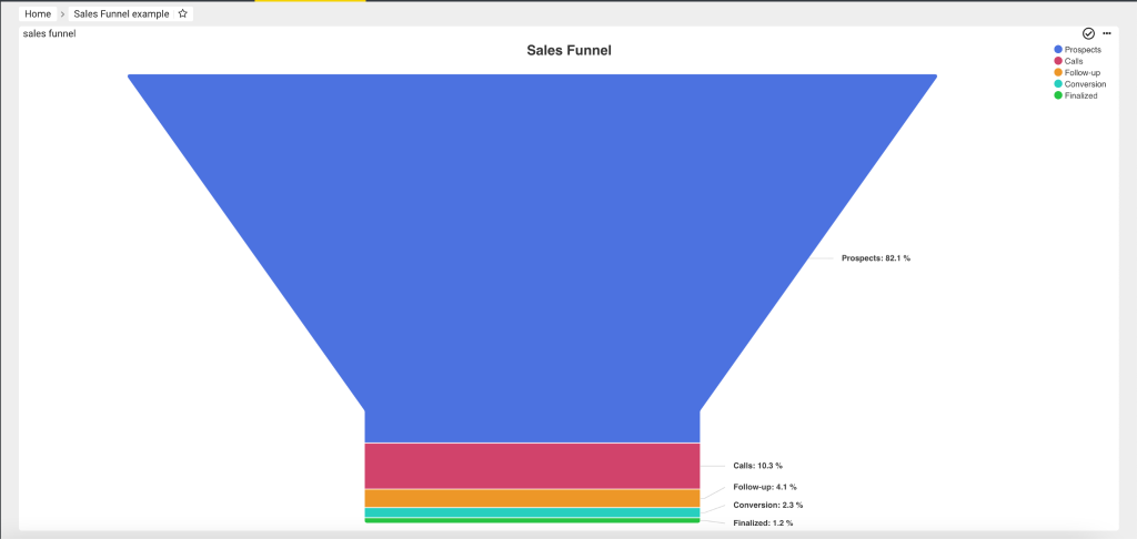
For example, the below funnel chart represents sales prospects at each stage in a sales process. The sales process starts by a company contacting prospective customers. At the top of the funnel, there are 2,000 prospective customers. The company starts pitching its product(s) to these sales prospects, and in the end, only 30 customers have made a purchase.
Creating a Funnel Chart
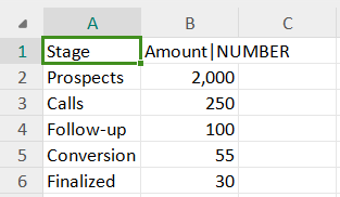
For the purpose of this example, we have used a CSV file containing different stages of the sales funnel, as seen in the screenshot above. You can download the file and follow the steps outlined in this video.
- Create a Server Filesystem connection.
- Off of this connection, create a CSV feed where you should upload our sales funnel csv file.
- Off of the created CSV feed, click to create a new visualization and select Funnel Chart.
- In Base FunnelChart:
a) Provide a name for the visualization.
b) Make sure Name Attribute and Value Attribute are populated with attributes from the csv. - In Series, enable the Dynamic Series toggle switch.
- In Options, you can leave the default values as they are, or you can set new values for each of the following:
a) Border Radius: Some charts like funnel and pyramid support rounded corners. Use this option to change the amount in pixels;
b) Border Radius Scope: Determines whether rounded corners apply individually to each data point (point) or collectively to each stack of data points (stack) in the funnel chart;
c) Show Legend: Displays data about the datasets that are appearing on the chart;
d) Legend Position: The position at which the legend will be displayed;
e) Show Label: Used to indicate what a certain position on the axis means;
f) Label max width: Defines maximum width of the label in pixels;
g) Label Distance: The distance of the label from the funnel’s edge. Negative numbers put the label on top of the funnel slices. Connectors are only shown for labels outside the funnel. The default is 30;
h) Show Zero Value: Used to display zero values;
i) Show Pyramid: Used to display values as parts of a whole in a triangular shape;
j) Show Chart in 3D: Used to visually enhance the chart; For more information, refer to the corresponding page. - Go to Preview to see the end result.
- Save and create a page for your visualization.