The Tooltip Action displays a tooltip with a list of details about a selected record. The Tooltip Action is very similar to the Show Record Details Action. The differences are:
| Tooltip | Show Record Details | |
|---|---|---|
| Presentation | Shows up as a bubble, with a small caret that points to the associated record. | Shows up as a dialog, with a close icon. |
| Scrolling | Does not support scrolling. Designed for small numbers of attributes. | Supports scrolling. Designed for large numbers of attributes. |
| Events | Designed to be used with Hover events. | Designed to be used with Click events. |
How to Configure Tooltips
Step 1: Add Action
Add the action as explained here.
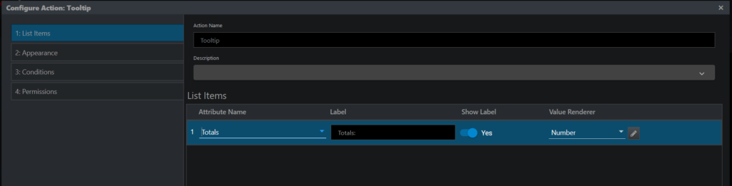
Step 2: List Items
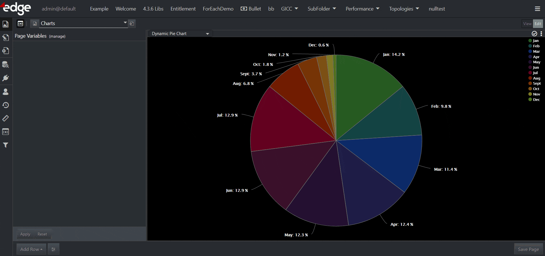
Tooltips are intended to be used with hover events and are designed to contain a small number of attributes. The user interface provides a list builder to manually add the attributes that will appear in the tooltip. The Tooltip display supports the same types of renderers found in a List Visualization. For Chart Visualizations, two additional attributes are included: Chart Measure and Chart Percentage, where Chart Percentage will be shown if the chart is percentage-based.
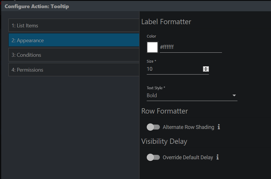
Step 3: Appearance
Here you can configure the appearance of the labels if the labels were enabled in List Items. Additionally, you can enable or disable Alternate Row Shading and override the default hover delay of 750 milliseconds.
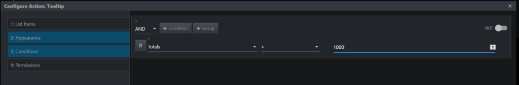
Step 4: Conditions
This step lets you specify additional conditions that determine when an Action is fired. For example, suppose you are working with some event data, and only want a tooltip when Totals < 1000. You can add that logic here in the conditions step, as shown in the screenshot:
Step 5: Permissions
Here you can exclude certain roles from accessing the action.
Tooltip Example
Custom HTML in Tooltips
edgeCore version: 4.5.0
Tooltips can display custom HTML.
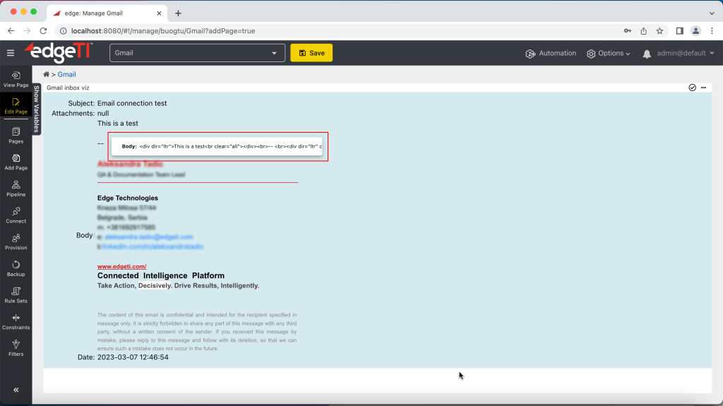
In this example, we are going to use the Email connection, that is, the List visualization that shows our Gmail inbox on a page.
- Go to the Edit mode and click the three dots in right corner > Edit Actions.
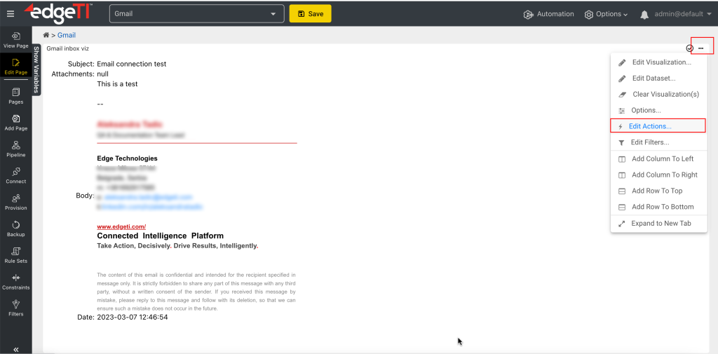
A pop-up is displayed. - Add a tooltip action.
A new window is displayed. - In Display Fields, add one or more fields. We are going to add just Body.
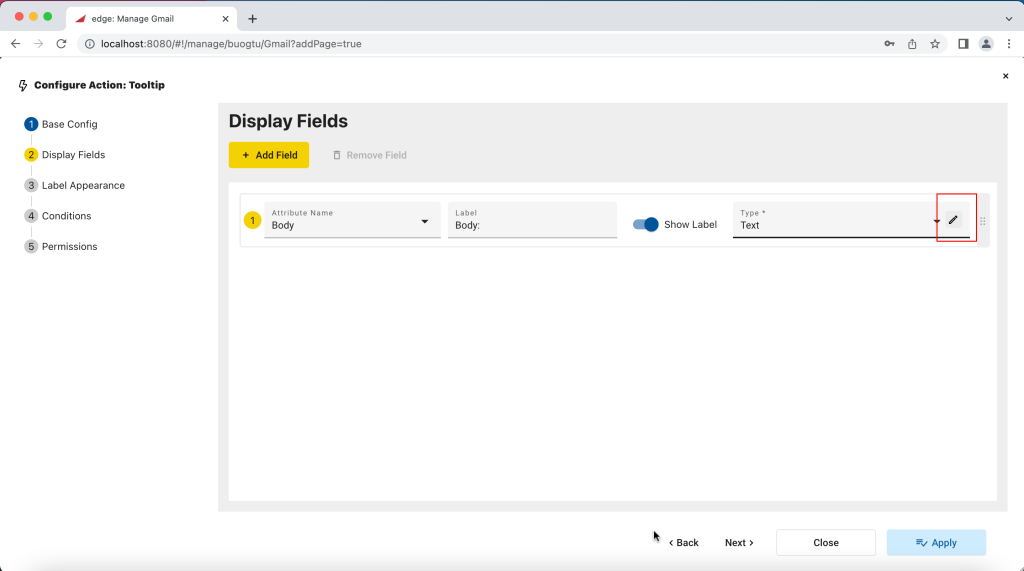
- Click the pencil icon next to the Type field.
- In the pop-up, enable the As Plain Text toggle switch and click Save.
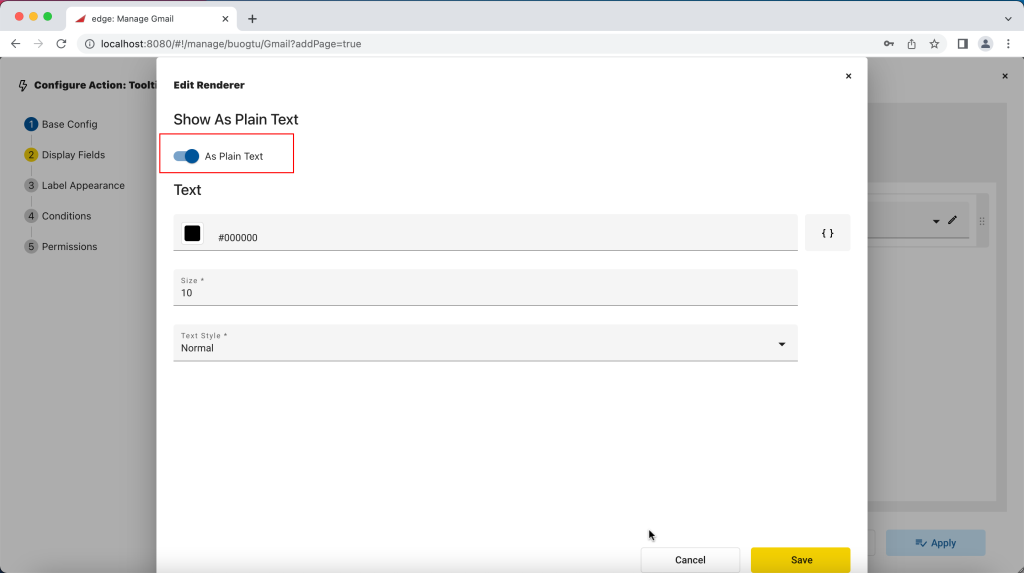
- Close the pop-up.
- On the page, hover over the visualization for the tooltip to appear.
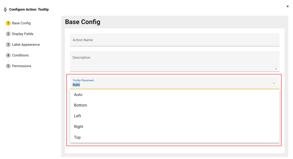
Tooltip Placement
edgeCore version: 4.6.1
When configuring or editing a hover action, you can set the position of the tooltip in Base Config > Tooltip Placement. Auto is the default value, which means the vertical position of the tooltip will depend on the position of the cursor on the screen – if the cursor is in the upper half, the tooltip will be displayed below the cursor, and if it is in the lower half, it will be displayed above.