Flow diagrams show relationships. They require a Flow Relational Model, which is just a mechanism used to define relationships within the data. Because of this dependency, Flow Diagram visualizations will only appear as an option off of Flow Relational Models.
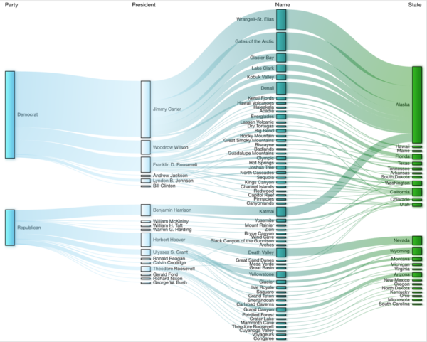
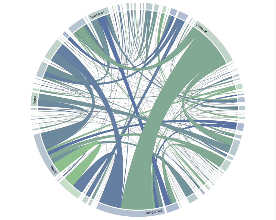
Examples above show a Sankey Diagram (left) and a Chord Diagram (right).
Types of Flow Diagrams
There are two different types of Flow Diagram visualizations available in edgeSuite.
1. Sankey Diagram

Sankey Diagrams show a horizontal flow through different Attributes, which are presented as separate columns of values. The size of each node in a column is scaled proportionally based on aggregated values defined in the underlying Flow Relational Model.
2. Chord Diagram

Chord Diagrams show a radial summary of values from all the Attributes, and highlight interconnectivity between those different values. The nodes along the outer radius are also scaled proportionally, based on aggregated values defined in the underlying Flow Relational Model.
Flow Diagram Configuration
Flow Diagram configuration is broken out into the following steps:
- Configure
Sets general flow diagram properties - Renderer
Determines the appearance of a flow diagram - Preview
Shows a preview of the configured flow diagram
Step 1: Configure
Name
A symbolic name used to represent this Visualization. This is the name that will show up in choosers when adding a Visualization to a page.
Diagram Type
This determines the type of Flow Diagram that will be rendered. Options are:
| Sankey | A Sankey diagram is a specific type of Flow Diagram, in which the width of the links is shown proportionally to quantity. |
| Chord | A Chord Diagram visualizes the inter-relationships between entities and compares similarities between them. |
Allow Diagram Type Change
This determines whether an end user will be able to change the Diagram Type. Options are:
| Yes | An end user will be able to change the Diagram Type at run time. The option will appear as a button in the Visualization’s footer. |
| No | An end user will not be able to change the Diagram Type at run time. The option will be hidden from end users. |
Show Node Tooltips
This determines whether or not to show default Tooltips on the nodes.
| Yes | A Tooltip will be shown when hovering over a node. |
| No | No Tooltip will be shown on hover over a node. |
Show Link Tooltips
This determines whether or not to show default Tooltips on the links between nodes.
| Yes | A Tooltip will be shown when hovering over a link. |
| No | No Tooltip will be shown on hover over a link. |
Step 2: Renderer
The Renderer step is broken out into two parts. The top section shows the attributes that have been related to one another in the Flow Relational Model. From here, you can adjust the colors of the values for each of the attributes, as well as the display name of the attribute itself.
Name
This is the name of the attribute as defined in the relational model.
Display Name
This property defaults to the raw attribute name, but it can be altered. It is used to display a different name that it will be more readable when presented.
Color Palette
This property sets a color scheme for each attribute. The values for an attribute will iterate through the colors defined in the color palette. If there are more unique values then colors, then the renderer will wrap and start over reusing colors in the same palette.
See Color Palettes for additional information.
★ Note: The renderer only affects how elements are displayed. Since reordering the attributes affects aggregated counts, it must be done inside the relational model itself.
The bottom section on the Renderer Step contains global text renderers that affect all attributes.
Label Options
Labels affect how individual values are rendered within the Visualizations.
Color
Determines the font color of all labels. Selecting a color is done via the color input field. Clicking anywhere within the color input field will open the Color Picker.
Size
Determines the font size of all labels.
| Min | 6 |
| Max | 256 |
Style
Determines font style for all labels
| Normal | Sample |
| Italic | Sample |
| Bold | Sample |
| Bold Italic | Sample |
★ Note: For Chord Visualizations, labels will be hidden based on available space. For very dense data, users might not see any labels at all.
Sankey Header Options
The Sankey Header Option section determines whether column headers will appear. If enabled, this section also determines what the headers will look like.
Show Header
This determines whether or not Attribute Names are shown.
| Yes | A row will appear at the top of the Flow Diagram visualization indicating the Attribute Name for the values in that column. |
| No | The row of Attribute Names at the top of the flow diagram will be hidden. |
Color
Determines the color of header values. See Color Picker.
Size
Determines the font size of header values.
| Min | 6 |
| Max | 256 |
Style
Determines the font style of header values.
| Normal | Sample |
| Italic | Sample |
| Bold | Sample |
| Bold Italic | Sample |
Step 3: Preview
Shows a preview of what the end Flow Diagram will look like.
Sample Data
Click here to download the National Parks data referenced on this page: National Parks Data Files