Color Palettes can bring a vivid perspective to many of edgeCore’s Visualizations. The product ships with a variety of stock color palettes, but system designers can also create their own custom color palettes using several different color schemes, called “Palette Types”.
Supported Palette Types
| Name | Description |
|---|---|
| Monochrome | A Monochrome Palette is a set of colors based off a single hue. The palette is programmatically generated by varying the saturation and lightness values for the selected hue (HSL model). |
| Duotone | A Duotone Palette is an interpolated set of colors based off of two hues. The palette is a programmatically generated range of colors between the two selected hues. |
| Custom | A Custom Palette allows you to build up a completely customized set of colors. |
Stock Color Palettes
The stock color palettes shown are provided as system defaults. They are locked, meaning they cannot be modified by administrators. They can be cloned, allowing an administrator to create a new palette based off of one of the system defaults.
| Name | Colors | Swatches |
|---|---|---|
| Autumn | 6 |  |
| Chart | 24 |  |
| ColorWheel | 12 |  |
| Default | 48 |  |
| Evergreen | 10 |  |
| Fire | 6 |  |
| Greyscale | 8 |  |
| Ice | 10 |  |
| Ocean | 6 |  |
| Spectrum | 16 |  |
| Spring | 11 |  |
| Summer | 8 |  |
Manage Color Palettes
To manage Color Palettes in edgeCore, navigate to System Menu → Color Palettes. This will launch a dialog showing all Color Palettes in the system.
Creating a New Color Palette
There are two ways to create a new Color Palette in edgeSuite:
- Click the
 icon in the Manage Color Palettes tool, accessible under System Menu → Color Palettes.
 - Click the icon in certain screens in the administration UI where a Color Palette is used. For example, on step 2 of configuring a Heat Map Visualization, or when Dynamic Series is set to “Yes” for a Pie Chart Visualization. This launches the “Add Palette” dialog.
The following properties are available when creating a new Color Palette:
| Name | Description |
|---|---|
| Palette Name | A symbolic name used to identify this palette. This value will appear in the pull-down menu when selecting a color palette. |
| Palette Type | This selects the color scheme to use for the new palette. The supported types are: – Monochrome – Duotone – Custom |
| Max Colors | This property determines the size of the Color Palette, meaning the total number of colors. – This property only appears for Monochrome and Duotone palettes, which are both generated palettes. – This value is derived for custom palettes, based on the number of colors specified. |
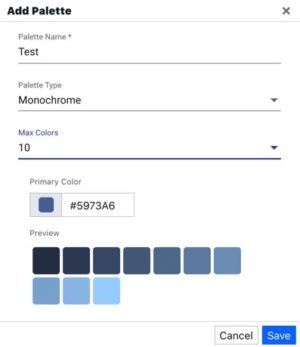
| Primary Color | This property appears for Monochrome and Duotone palettes. – Monochrome: Primary color sets the Hue to use for the entire palette. – Duotone: Primary color sets the first color in the color range. |
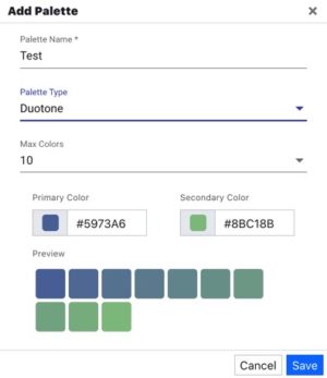
| Secondary Color | This property appears only for Duotone palettes. It sets the secondary color in the color range. |
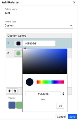
| Custom Colors | This control only appears for the “Custom” palette type. Custom colors lets you add as many individual colors to the palette as you like. |
| Preview | Displays all of the colors that will be in your custom palette. |
Monochrome Palette
A Monochrome Palette is a set of colors based off of a single hue, which is supplied using the “Primary Color” property. The palette is then programmatically generated by varying the saturation and lightness values for the selected hue (HSL model) to provide the specified number of color swatches.
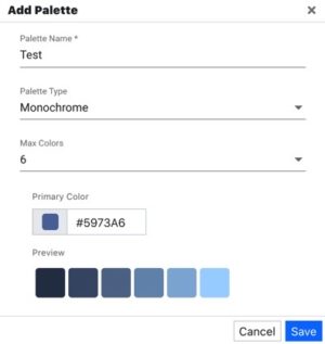
Increasing the “Max Colors” property will increase the number of monotone color swatches in the set.
Duotone Palette
A Duotone Palette is an interpolated set of colors based off of two hues:
- Primary Color
- Secondary Color
The palette is a programmatically generated range of colors between the two selected hues.
Custom Palettes
A Custom Palette allows you to build up a completely customized set of colors. The plus button will add a new color to the color list. A color can be selected visually, or manually entered using a HEX value.