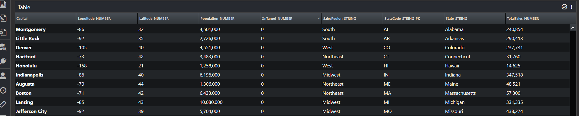
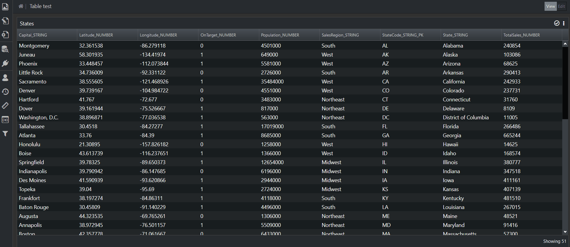
The Table Visualization allows you to select attributes from a tabular data set, and display them as a table. Table supports individual column renderers, which means the values for each attribute can have a customized presentation.
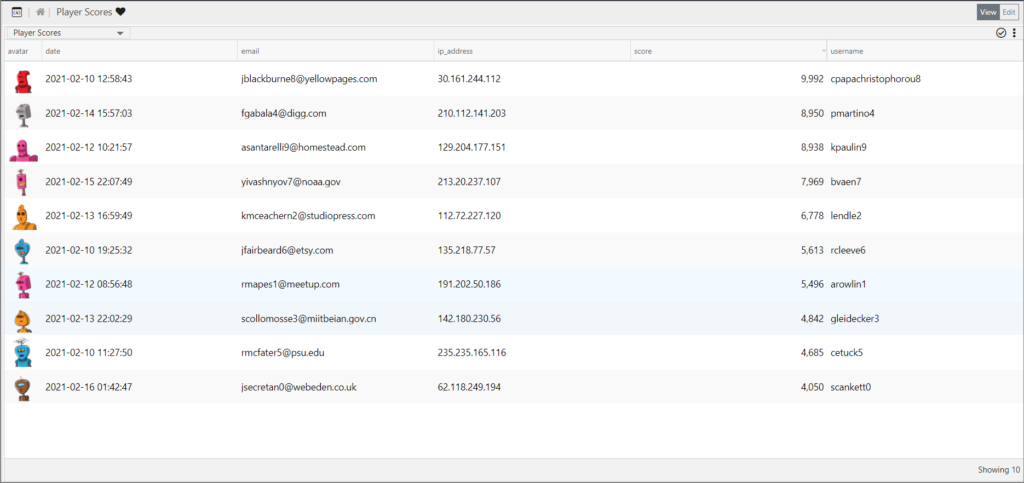
Table Configuration
Table configuration is broken out into the following steps:
- Base Table
Sets general table properties. - Columns
Defines which attributes are displayed as table columns. - Column Renderers
Affects how the values in the cells and backgrounds are rendered. - Sort
Defines default sort for the table. - Preview
Shows a preview of the configured table.
Step 1: Base Table
Visualization Name
A symbolic name used to represent this Visualization. This is the name that will show up in choosers when adding a Visualization to a Page.
Default Font size
Sets the default font size for the table.
- Larger
- Large
- Normal
- Small
- Smaller
Virtual Scrolling
Virtual Scrolling greatly improves performance of large datasets. It does this by displaying only a small amount of the available information at a time. This limits the DOM required, greatly speeding up the display. The downside is that in order for scrolling to work properly, virtual scrolling requires uniform row heights. To achieve this, the word wrap option within cell renderers will be disabled.
Disabling virtual scrolling means that ALL rows will be loaded. This option enables word wrap within cell renderers, allowing row height to grow and shrink based on the amount of text in a cell. This approach works fine for smaller data sets, but it can lead to performance issues if too many rows of data are returned.
| Yes | Enables virtual scrolling. This greatly improves performance of large datasets but it also requires uniform row heights. Will disable word wrap within cell renderers. |
| No | Disables virtual scrolling. This means that all rows will be loaded, which can cause performance issues with large datasets. Will enable word wrap within cell renderers. Use of a Client Pagination Filter is highly recommended. |
Allow Column Reordering
Determines whether an end user can drag and drop columns to rearrange column order.
| Yes | Enables column reordering. Rearranged columns will only persist for the current session. Once a user logs out, the column order will return to the order configured by the administrator. |
| No | Disables column reordering. |
Allow Column Hiding
Determines whether an end user can hide/unhide columns at runtime.
| Yes | An end user can show and hide table columns. The user’s visibility preferences will only persist for the current session. Once a user logs out, the column visibility will return to what was configured by the administrator.The end user will be able to toggle column visibility using the  icon, which will appear in the Visualization header. icon, which will appear in the Visualization header. |
| No | Disables column hiding.The icon will not be displayed in the Visualization header. |
Show Row Count in Footer
Determines whether the total row count is displayed in the table footer.
| Yes | The total number of records in the current data set will appear in the table footer. |
| No | Hides the total number of records in the table footer. |
Enable Row Shading
Determines how row background colors are applied.
| Yes | Allows for customization of the background color of each row. |
| No | Row background colors will alternate based on values defined in the theme. |
Static Row Shading
This row shading option will remove the default alternating row colors, and allows an administrator to apply a static background color for all the rows.
Derived Row Shading
This row shading option allows an attribute’s value to determine the background color of each row.
★ Note: Background colors defined in column renderers will override the background color of a row.
Column Header Appearance
This section groups together a set of properties that affect Column Headers in the table.
Color
Determines a static color for all column headers.
Size
Determines the font size for all column headers.
| MIN | 1 |
| MAX | 256 |
Style
Determines the font style for all column headers.
| Normal | Sample |
| Italic | Sample |
| Bold | Sample |
| Bold Italic | Sample |
Step 2: Columns
This step determines which attributes in a dataset will appear as columns in the table.
Attribute Name
Each Attribute Name in this list represents a column in the table. The columns will appear in the order displayed here.
Display Name
This is used to override the raw attribute names in the data set with something better suited for display as a column header. This property defaults to the Attribute Name.
Column Width (pixels)
This specifies a width for each column. Width can be defined in two ways:
| Min-Width | This specifies the smallest a column can be. It will grow when more space is available. |
| Fixed | This specifies the width of the column in pixels. It will not change even when more space is available. |
Header Alignment
This property only affects the column header. It allows you to set the data type of that column and position headers.
- When creating new Table Visualizations, this property will default to “Auto”.
- When upgrading from versions prior to edgeCore v3.4, this property will default to “Left”, ensuring that existing tables do not change.
| Auto | Text alignment is determined by the data type for that column.Attributes containing NUMBERs will be aligned rightAttributes containing STRINGs will be aligned left. |
| Left | Forces the header to be aligned left. |
| Center | Forces the header to be centered. |
| Right | Forces the header to be aligned right. |
Visible
This property affects the default visibility of a column. When “Allow Column Hiding” has been set to Yes, columns that are hidden by default can be enabled at runtime using the icon.
| Checked | The column will be visible by default. |
| Unchecked | The column will be hidden by default. |
Step 3: Column Renderers
Column Name
This is a read only version of the column name from the previous step. It shows the display name, not the raw attribute name.
Cell Renderer
Cell Renderers combine multiple concepts together.
- It affects how the value in the cell is rendered
- It affects how the background of the table cell itself is rendered.
Editing a cell renderer [ ] brings up a single dialog with all the options for the selected renderer type.
Table Renderers include:
| Icon | Table’s icon renderer combines:An Icon Renderer to determine which icon is displayed.A Color Renderer to determine the background color of the table cell. |
| Number | Table’s number renderer exposes numeric formatting that determines how to handle decimal places, commas, and negative numbers. It also combines:A Text Renderer to determine how the number is displayed.A Color Renderer to determine the background color of the table cell. |
| Text | Table’s text renderer combines:A Text Renderer to determine how the text is displayed.A Color Renderer to determine the background color of the table cell. |
| Image Source | Table’s image source renderer takes an image source string (can be either a data:image string [e.g. data:image/png;base64,…] or a URL) and renders the given image. |
See the Renderers section for more details.
Cell Alignment
| Auto | Text alignment is determined by the data type for that column.Attributes containing NUMBERs will be aligned rightAttributes containing STRINGs will be aligned left. |
| Left | Forces the cell to be aligned left. |
| Center | Forces the cell to be centered. |
| Right | Forces the cell to be aligned right. |
Step 4: Sort
This step allows an administrator to set a default sort for the table.
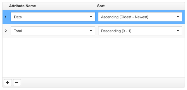
- An end user can alter the sort setting for the current session by simply clicking on table headers.
- Shift + Clicking on multiple column headers will allow an end user to apply a multi-column sort.
Step 5: Preview
Shows a preview of what the Table Visualization will look like.
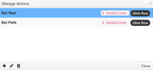
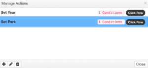
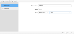
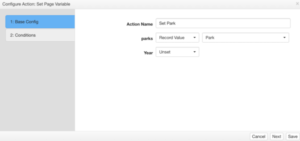
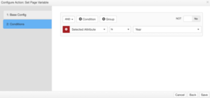
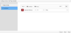
Table Actions: Row vs. Cell Selection
In edgeCore v3.2 and higher, there is no longer a “Table selection mode”. The table’s selection behavior is determined through actions, and is achieved by using a condition on those actions. The example below shows how to make click actions behave differently based on a specific attribute within the record. The example shows a Set Page Variable action, but the same approach applies to a Switch to Page action.
| Action 1 | Action 2 |
|---|---|
 |
 |
 |
 |
 |
 |
EdgeCore 4.3.2 Version
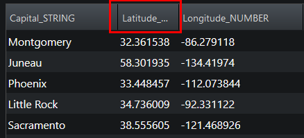
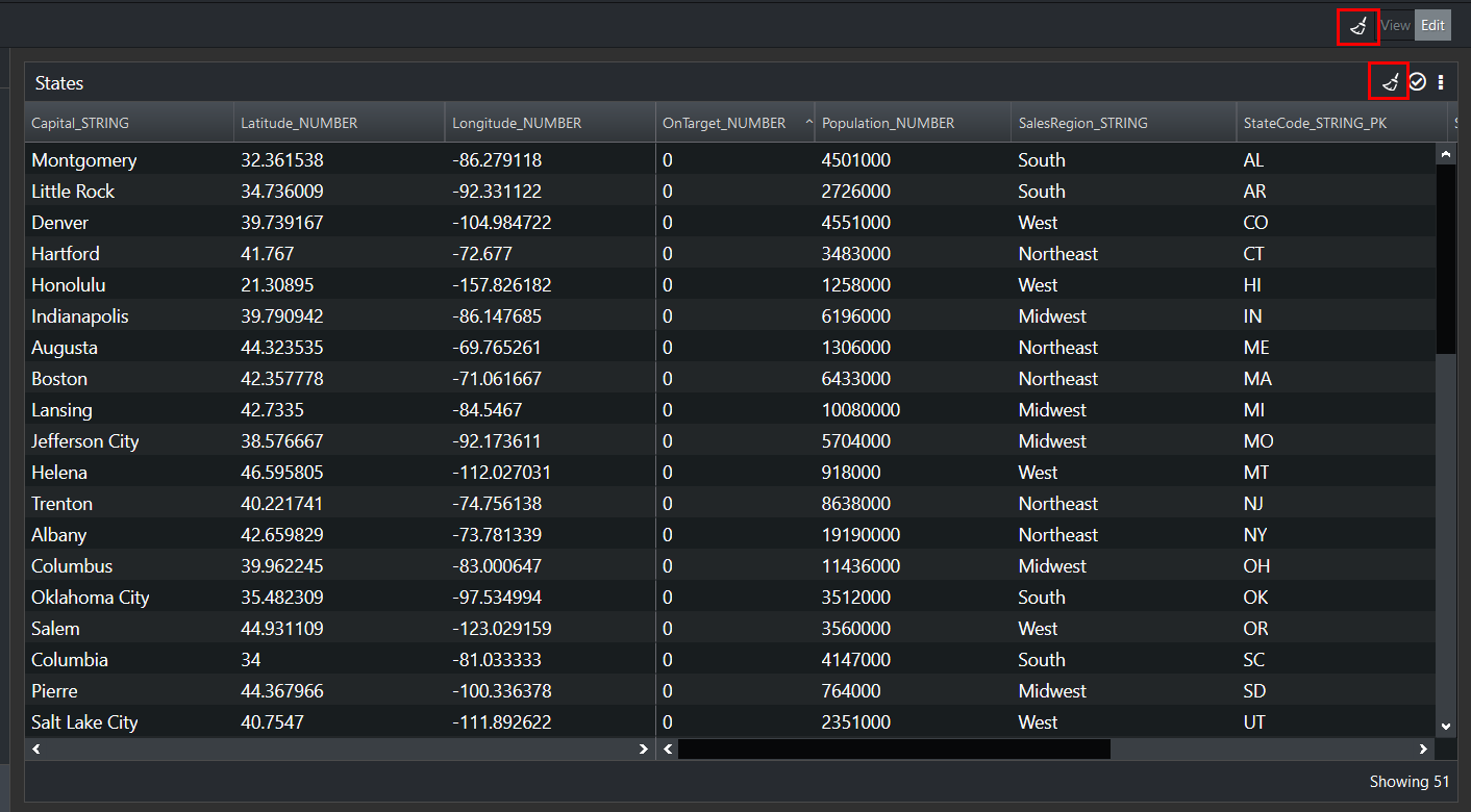
Column Headers
Table columns have borders between them which can be moved/dragged to resize them as needed. To make the column narrower, drag to the left. To make the column wider, drag to the right. You can move the border back and forth as much as you want. Additionally, the columns can be reordered via drag and drop.
Styling Column Header Text
Text Cropping
When there is not enough space to display the whole text in the column header, the system will crop the said text and display it with … ellipsis.
Multi-line Text
Text/labels in column headers are not automatically split into multiple lines. If you want text to be multiple lines, you can add the <br> tag to the display name inside the table configuration, as described below.
How to Add HTML Tags to Table Configuration
To style column header text, you can add HTML tags to the display name inside the table configuration.
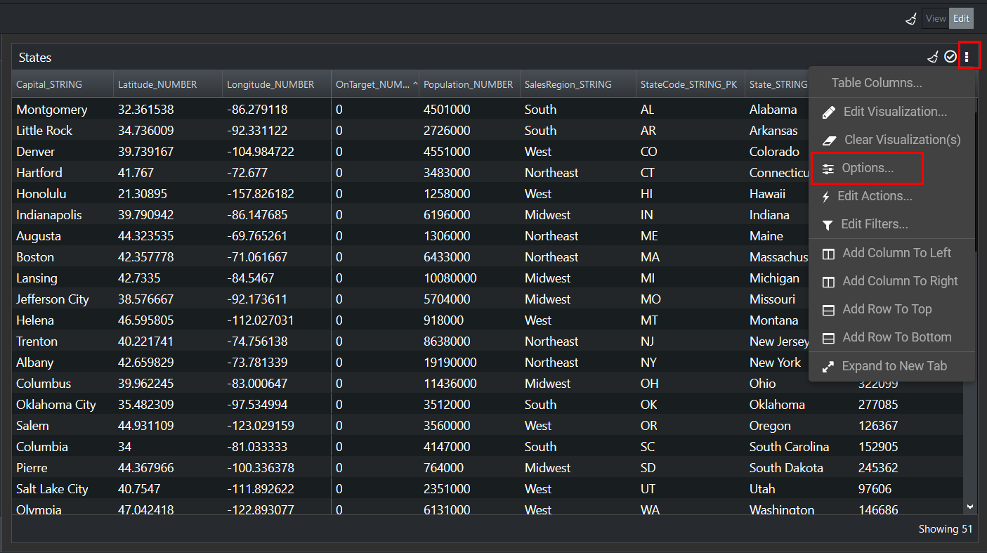
- Go to the page containing the table whose column header you want to style.
- Click Edit in the top-right corner.
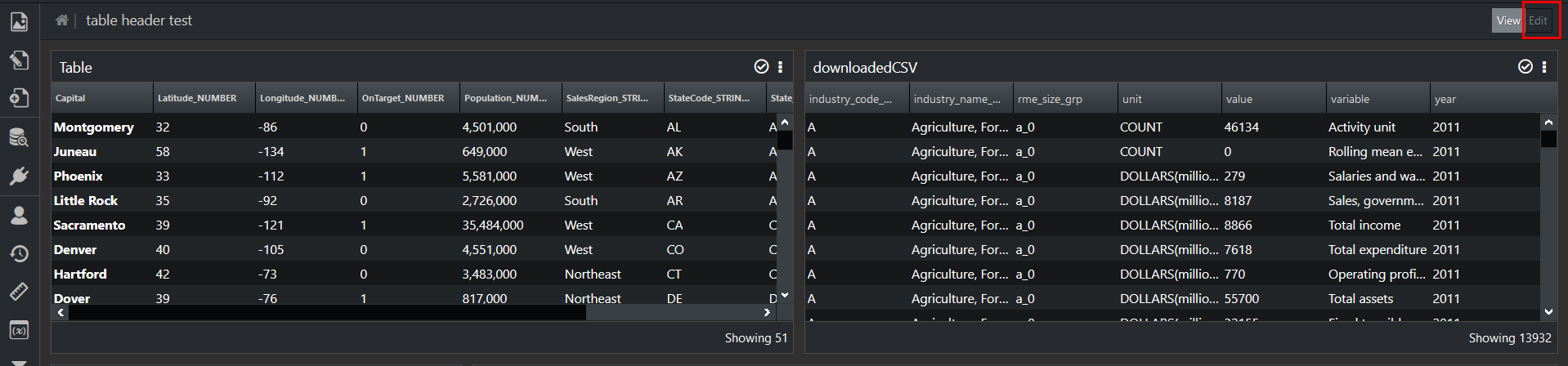
You are now in the edit mode. - Click on the three dots > Edit Visualization.
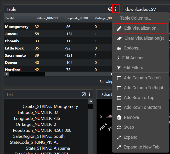
You are now in the edit mode. - Click Columns on the left side of the screen.
- In Display Name enter the tag you want (see supported tags below).
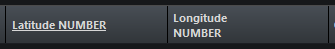
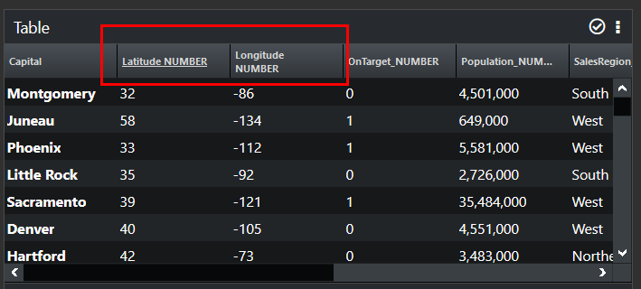
For example, you want Latitude_NUMBER to be underlined, so you would add the <u> tag. Moreover, you want Longitude_NUMBER to be multiple lines, so you add the <br> tag.
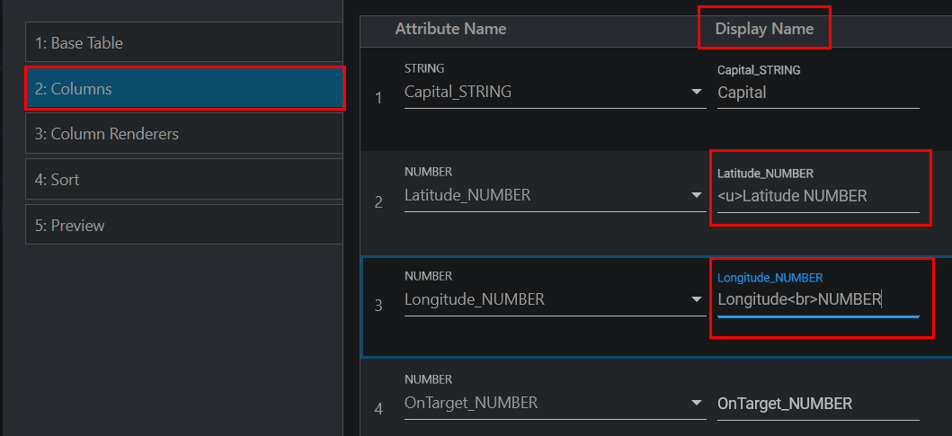
- Go to Preview to see what these two column headers look like.
- Click Save and Close.
Header changes are applied and displayed in the table.
Supported HTML Tags
The following table contains HTML tags that can be used to style column header text.
| Tag | Description |
<b> |
Defines bold text |
<br> |
Defines a single line break |
<cite> |
Defines the title of a work |
<code> |
Defines a piece of code |
<dfn> |
Specifies a term that is going to be defined within the content |
<em> |
Defines emphasized text |
<i> |
Defines a part of text in an alternate voice or mood |
<kbd> |
Defines keyboard input |
<legend> |
Defines a caption for a <fieldset> element |
<mark> |
Defines marked/highlighted text |
<marquee> |
Defines a scrolling area of text |
<q> |
Defines a short quotation |
<s> |
Defines strikethrough text |
<small> |
Defines smaller text |
<strong> |
Defines important text |
<sub> |
Defines subscripted text |
<sup> |
Defines superscripted text |
<u> |
Defines text that is unarticulated and styled differently from normal text; Typically displayed with an underline |
<var> |
Defines a variable in a mathematical expression or a programming context |
EdgeCore 4.3.3 Version
The use of the ag-Grid enables you to:
- Wrap text in column headers and cells
When editing a visualization, by setting one column to word wrap (done by selecting the Word Wrap checkox on the Column Renderers tab), the column height becomes automatic. If the checkbox is not selected for any column, the height defaults back to the height set in the configuration. - Reorder columns via drag and drop
Note that dragging a column out of the grid will hide the column, but you can bring it back by refreshing the page. - Pin one or more columns to the left or to the right
To do so, drag the column to the edge of the grid and wait for approximately one second. The grid will create a pinned area and place the column into it. When the user scrolls, all other columns move left and right except for the pinned ones.
When editing a visualization, specifying how/if pinning gets rendered is done on the Column Renderers tab.
Note: Please limit the usage of pinning columns on the right side of the table as pinning too many columns (or wide columns) on the right can create unwanted scrolling limitations to the rest of your table. - Resize columns by pushing adjacent columns to the left or right by holding Shift
- Resize columns by dragging the edge of the column header
- Sort a column by clicking the header
- Sort multiple columns by holding Shift
- Have column width, sort, pinning and order preserved when persistence is enabled on the visualization
Additionally, virtual scrolling is always on.
Visualization State Persistence
To specify how a visualization state (your modifications) is persisted:
- Go to the page containing the table visualization.
- Click Edit in the top-right corner.
- Click on the three dots > Options.
A new page is displayed.
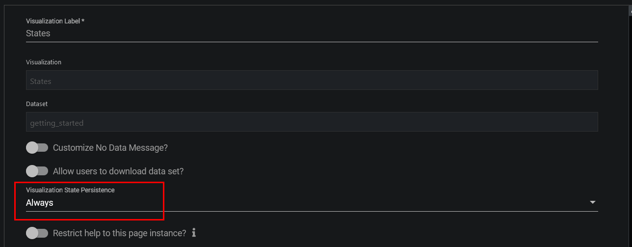
- From the Visualization State Persistence dropdown, select how the state is persisted.
– Always: the state will be saved to server preferences;
– Session : the state will be saved only to client;
– None: the state will reset on each page visit; - Save changes.
To remove past modifications made to the visualization (for example, you resized or reordered the columns), click the broom icon in the table header and the visualization will default back to the configuration settings. Moreover, clicking the same broom icon next to the View button will remove past modifications of all visualizations on the page (provided those visualizations have persistence turned on).
EdgeCore 4.3.5 Version
- Holding Shift resizes both adjacent columns.
- Not holding Shift pushes the adjacent columns to the left and right.
 Note: Please limit the usage of pinning columns on the right side of the table as pinning too many columns (or wide columns) on the right can create unwanted scrolling limitations to the rest of your table.
EdgeCore 4.5.1 Version
Maintaining Scroll Position on Table Data Updates
To keep the table scroll position unchanged when data updates, enable the Maintain Scroll toggle switch. As a result, you are able to simulate multiple selection on the table without the user losing his place.
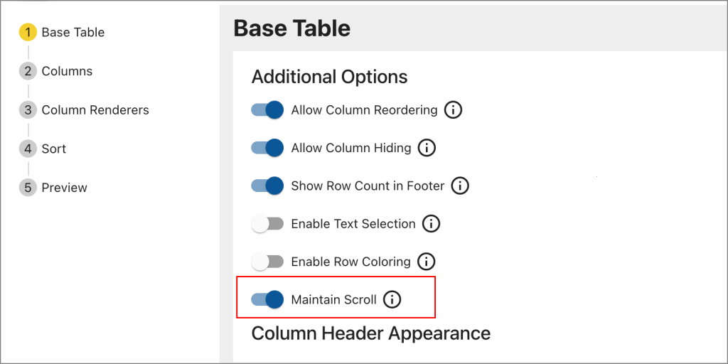
You can watch a short demo here.
Related page: Multiple Selection
EdgeCore 4.6.1 Version
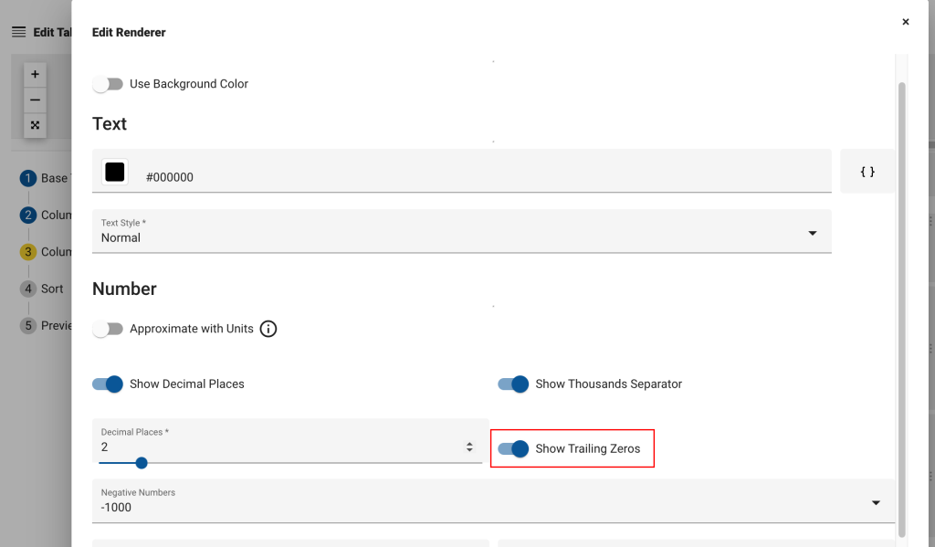
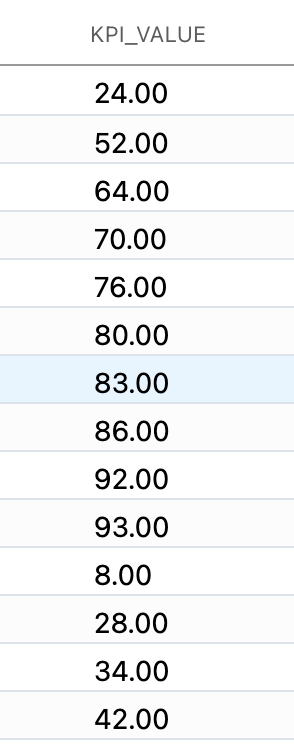
Show Trailing Zeros
In previous versions, trimming zeros was the default behavior. In order to show zeros, first enable Show Decimal Places and then Show Trailing Zeros.
example:
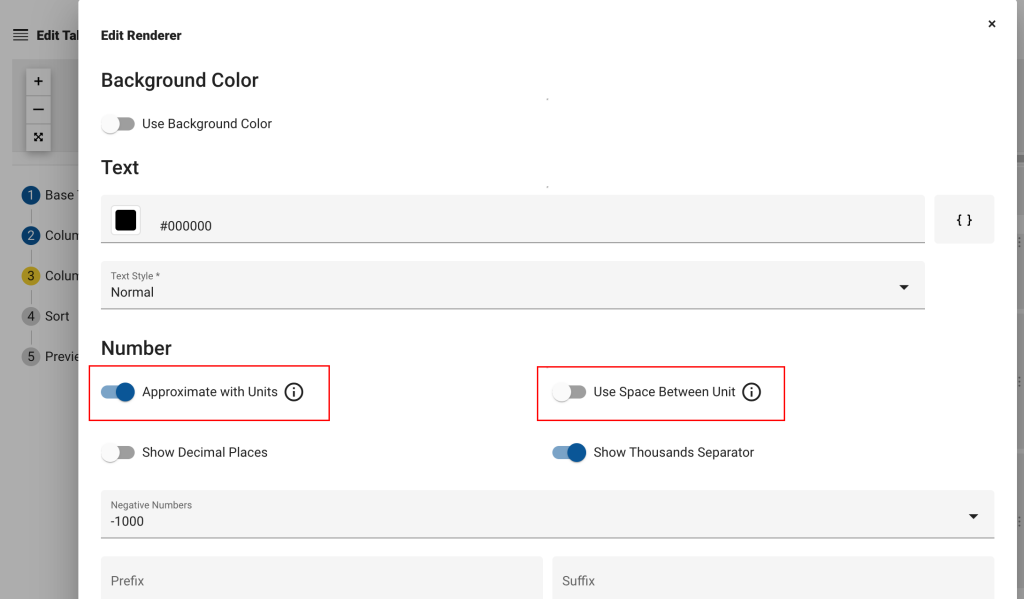
Approximate with Units
Enable this option to approximate to thousands, millions, billions, or trillions. A unit will be appended, as seen in the example below.
example:
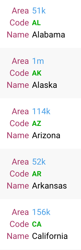
When Approximate with Units is enabled, the Use Space Between Unit option appears, which is used to place a space between the approximate unit.
EdgeCore 4.6.2 Version
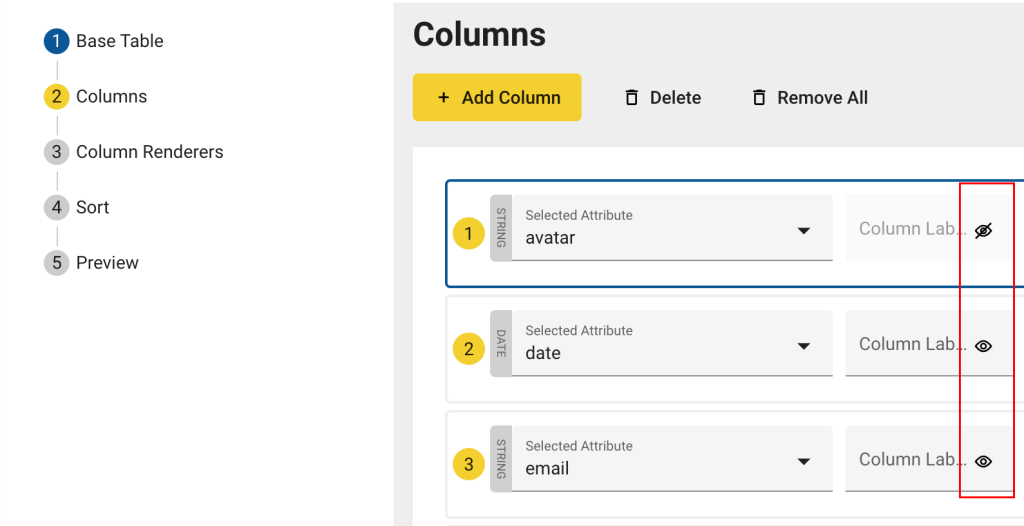
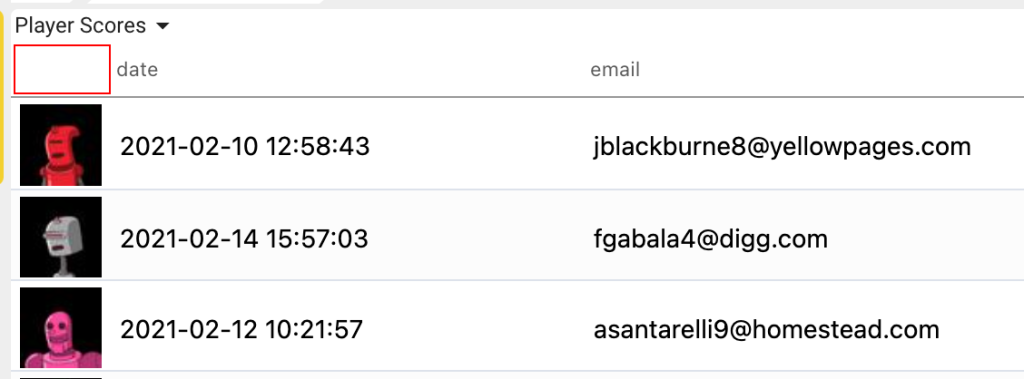
Column Header Label Visibility
If you do not want to show column header labels, click the eye icon next to the label field(s).
In the following example, the avatar label is no longer visible.
Known Issue
- The font size does not change when you apply a rule.