edgeCore version: 4.3.7
A time series is a collection of data that consists of measurements and the times when the measurements are recorded, and as such this type of transformation shows changes over time.
Examples of time series include the following:
- Server performance (CPU usage, I/O load, memory usage, and network bandwidth consumption)
- Temperature over time
- Stock market prices over a period of time
Using time series helps you:
– understand how data and processes change over time
– detect anomalies and emerging trends
– make predictions on future data values
Creating Time Series
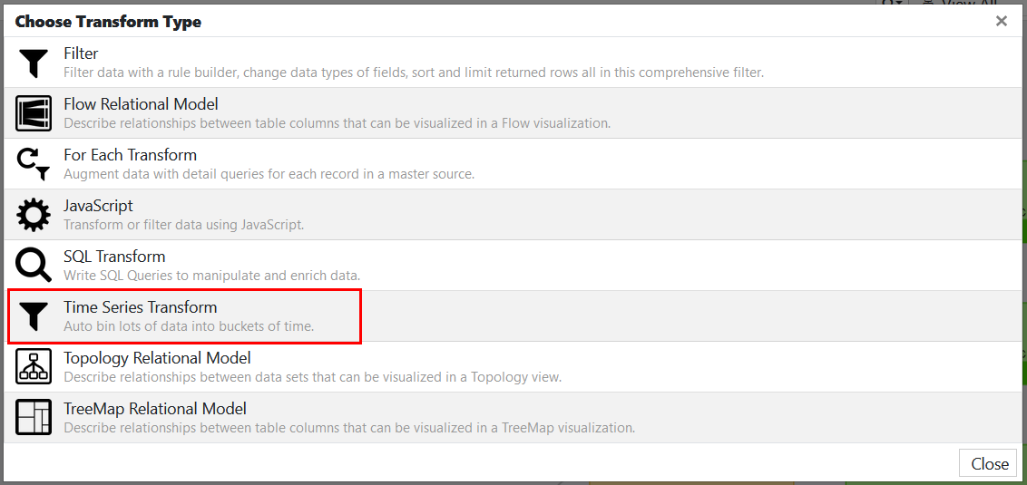
Step 1: Upload Data & Choose Time Series as Transform Type
When creating a new transform off of a feed, select the Time Series Transform.
Step 2: Configure Time Series
- In Config, do the following:
a) In Transform Name, provide a name.
b) In Date Attribute, select a time-based attribute (Date/Timestamp) to bin results by.
c) In Time Zone, select the time zone for bin placement.
d) In Unit, select a bin unit/interval (seconds, minutes, hours, days, months, or years).
e) In Unit Value, select a bin size.
– If you select Seconds as a unit, unit value can be 1, 5, 10, 15, or 30.
– If you select Minutes as a unit, unit value can be 1, 5, 10, 15, or 30.
– If you select Hours as a unit, unit value can be 1, 2, 3, 6, or 12.
– If you select Days as a unit, unit value can be 1, 7, or 14.
– If you select Months as a unit, unit value can be 1, 3, or 6.
– If you select Years as a unit, you can enter any unit value (1 being the minimum allowed value).
f) In Bin Anchor, select an anchor point, that is, when units/intervals will be anchored.
– For hours greater than 1, you can choose any anchor point (midnight is the default).
– If a unit value for days is 7 or 14, you can choose any day of the week as the anchor point (Monday is the default). Note: As of 4.3.8, the default value is Sunday.
– If a unit value for months is 3 or 6, you can choose any month as the anchor point (January is the default).
g) Enable the Add empty time bins for gaps in source data toggle switch to fill in the gaps if there are any missing date entries (for example, if you have Monday, Tuesday, and Friday in the source date, empty data sets for Wednesday and Thursday will be added). - Click Next.
- In Data Attributes, select one or more attributes to include in the summary and aggregate the data.
- Click Next.
You are taken to the Upstream Variables tab, where you should satisfy upstream variables if there are any. Proceed to Preview to view the result. Each result row has the start timestamp of the bin, bin size, and the data attributes. - Save your changes.
Time Series Aggregation
Depending on what you want to measure, the data can vary. For example, you might want to know which month had the highest temperature. In this case, you would compare the maximum temperature for each month.
Aggregation is the process of combining a collection of measurements. There are several ways to aggregate the time series data:
- First – returns the first value in the collection
- Last – returns the last value in the collection
- Min – returns the smallest value in the collection
- Max – returns the largest value in the collection
- Average – returns the sum of all values divided by the total number of values
- Median – returns the average of the two middle values
- Sum – returns the sum of all values in the collection
Step 3: Visualize Time Series Data
Chart visualization is the simplest way to show trends over time, so you may consider it the default visualization for a time series.
You can use one of the following chart types:
| Type | Description |
| Area | Resembles a line chart, but the area between the axis and line is commonly emphasized with colors |
| Area spline | Displays data points connected with a fitted curve and a color below the line |
| Bar | Displays data points as a bar |
| Bubble | Displays data points in a 3-dimensional space; The third dimension is represented through the size of the bubble; |
| Column | Displays data points as proportional vertical columns |
| Line | Displays data points as straight lines |
| Pie | Useful if you want to see the sum of all the events of each status |
| Spline | Connects a series of data points with a fitted curve through the data points |
| Scatter | Displays data points as dots |
Example
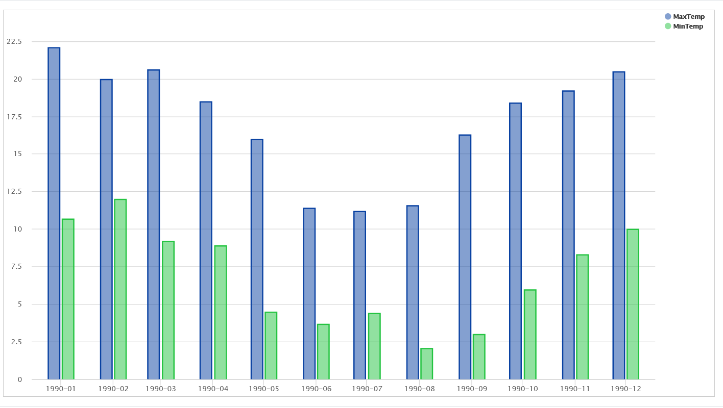
In our example, we want to compare monthly temperatures in 1990 to see minimum and maximum values.
Step 1:
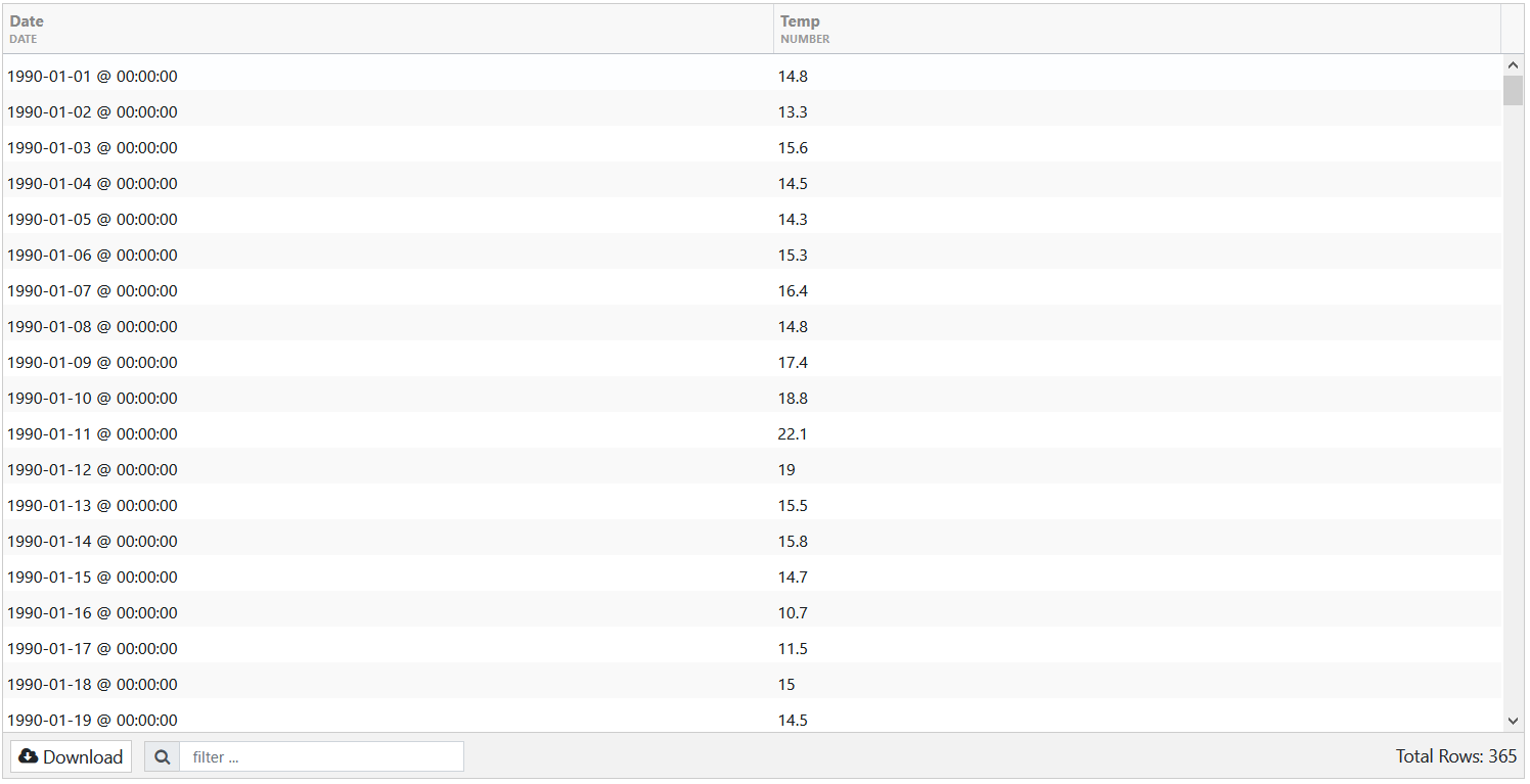
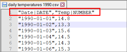
We have uploaded a csv containing daily temperatures throughout 1990. The data is displayed in the Date and Temp columns.
Tip: When you upload a csv, make sure that Date is displayed as DATE type. If that is not the case, access the csv in [INSTALL_HOME]/data and edit it by adding |DATE in the column name.
After creating a feed, we proceed by creating a new transform — Time Series Transform.
![]()
Step 2:
We have configured the following on the Config tab:
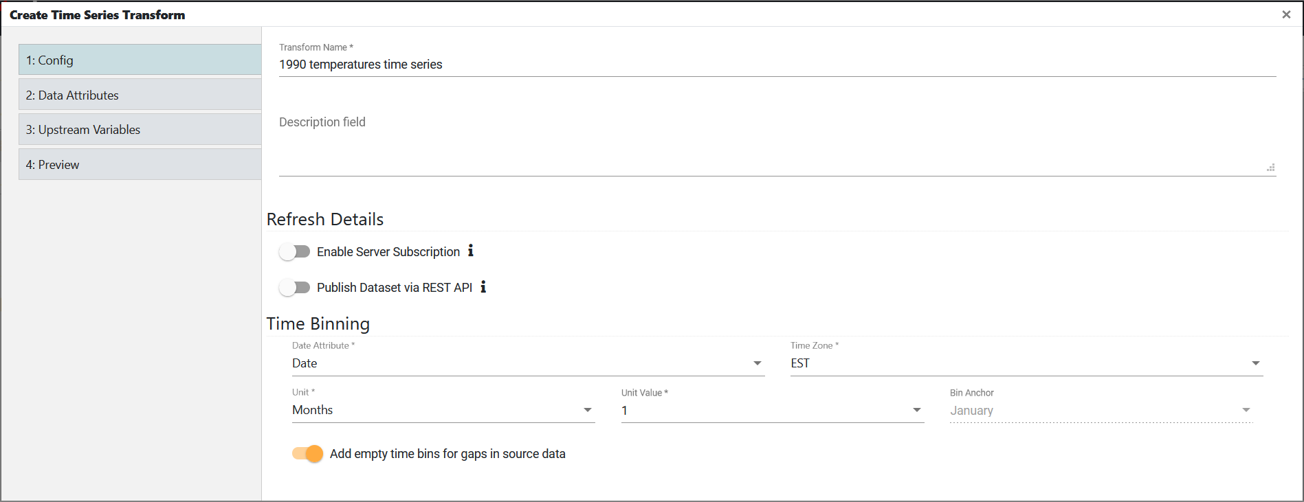
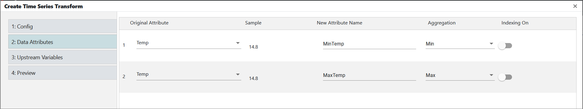
In Data Attributes, we have added the same attribute twice. Since we want to see minimum and maximum values, we have modified the attribute name and aggregated the data.
We do not have any upstream variables, so we proceed to Preview to view the result.
Step 3:
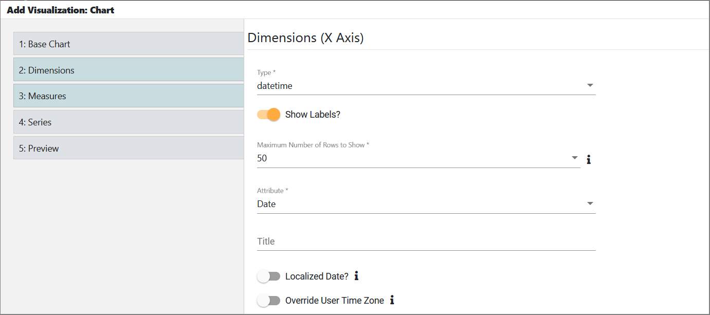
As the final step, we have chosen the Chart visualization to visualize the time series data.
For chart type, we have used a column.
This is what we have configured in Dimensions:
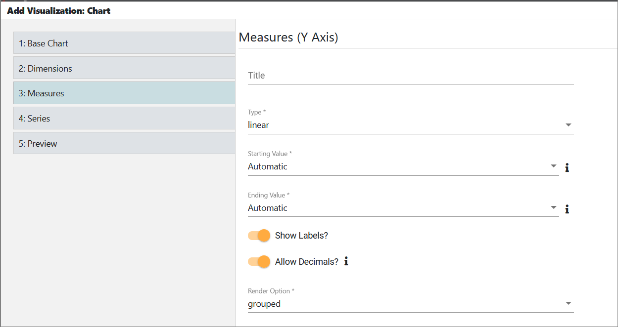
And in Measures:
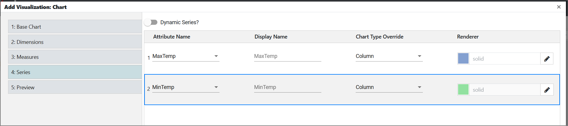
In Series, we have added both the minimum and maximum attributes.
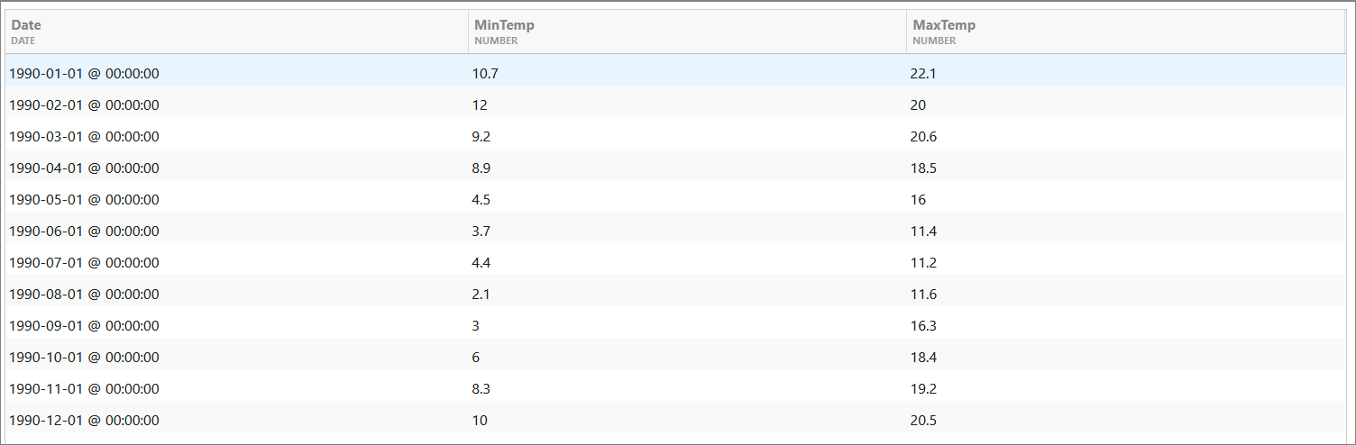
In Preview, we see the final result: