
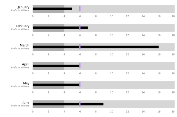
The Bullet Chart is a visualization that lets you quickly view values against comparative values.
Bullet Chart Configuration
The Bullet Chart Visualization configuration is broken out into six steps:
- Base Options
Identifies the name and base appearances of the Visualization. - Target Values
Configure the target values of the data. - Labels
Configure the appearance of all the labels. - Sort Options
Configure the initial sort of the data. - Ranges
Configure the ranges of the data that will colorize the chart background for easy quantitative comparisons. - Preview
Step 1: Base Options
Name
A symbolic name used to represent this Visualization. This is the name that will show up in choosers when adding a Visualization to a Page.
Chart Height
Set the height of each chart in pixels.
Value Field
The Value Field is used to retrieve the value of the chart from the data. It affects the size of the main bar of the chart and reflects the actual value of the chart.
Value Color
Choose a color formatter for the value bar. See Color Formatter for more details.
Min Value Strategy
Configure what minimum value will be shown on the axis of the chart.
| Static | Type in a value that will be used to set the minimum value of the chart’s axis. |
| Calculated | Automatically calculate an appropriate minimum value of the chart. |
| From Field | Choose a field in the data that will set the minimum value on each chart. |
Max Value Strategy
Configure what maximum value will be shown on the axis of the chart.
| Static | Type in a value that will be used to set the maximum value of the chart’s axis. |
| Calculated | Automatically calculate an appropriate maximum value of the chart. |
| From Field | Choose a field in the data that will set the maximum value on each chart. |
Normalize Min/Max Calculations
When the min or max values are set to the Calculated setting, this option (when set to Yes) will set the minimum and maximum value on each chart to the minimum and maximum value found across the entire data set.
| Yes | Set the minimum and maximum value on each chart to the minimum and maximum value found across the entire data set. |
| No | Each chart will have its own minimum and maximum value based on its data only. |
Show Decimal Values On Axis
Setting this to Yes will allow decimal values on the axis values. Setting this to No is useful when your data should never represent partial values, like ticket counts.
| Yes | Allow decimal values on the axis values. |
| No | Do not allow decimal values on the axis values. |
Override Axis Interval
Setting this to Yes will allow for custom axis tick intervals to be set. This is useful when wanting to make the axis values whole numbers instead of decimals.
| Yes | Customize the axis value intervals. |
| No | Axis intervals will be automatically calculated. |
Axis Interval Value
This is visible when “Override Axis Interval” is set to Yes. Setting this to a value of 1 will ensure only whole numbers are used. A value of 5 will make each axis tick a multiple of 5.
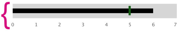
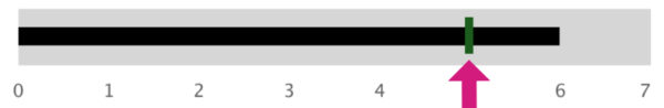
Step 2: Target Values
Show Target Value
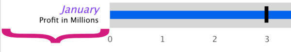
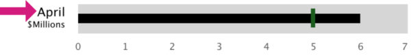
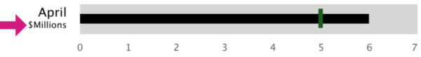
The Target Value shows the expected goal value of the chart. Its purpose is to quickly show comparative measures.
| Yes | Show target values on the chart. This will enable and show the Target Value configuration below. |
| No | Do not show target values on the chart. |
Target Value Strategy
Set a Static or Field value for each chart.
| Static | Type in a number that will be used as the target value. |
| From Field | Choose a field in the data that will set the target value on each chart. |
Target Value
A static number that will be used on all of the charts as the target.
Target Color
Choose a color formatter for the target indicator. See Color Formatter for more details.
Target Size
Configure the size of the target indicator.
| Thin | Thin size |
| Medium | Medium or default size |
| Wide | Wide size |
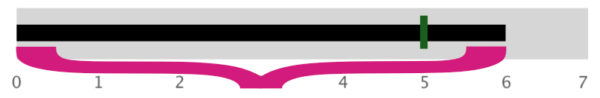
Step 3: Labels
Label Margin (pixels)
Set the amount of space devoted to label rendering.
| Min | 50 pixels |
| Max | 500 pixels |
Primary Label Value Strategy
Set a Static or Field value for each primary label.
| Static | Type in a value for the label that will be displayed on all charts.This is rarely used on the primary label. |
| From Field | Choose a field in the data to display as the primary label value. |
Show Secondary Label
Setting this to Yes will enable/show configuration for secondary labels on the charts.
| Yes | Show secondary labels on the chart. Enables the visibility of configuration of the secondary label. |
| No | Do not show secondary labels on the chart. |
Secondary Label Value Strategy
Set a Static or Field value for each secondary label when enabled.
| Static | Type in a value for the label that will be displayed on all charts.This is often used on secondary labels to show a unit of measure for the axis. |
| From Field | Choose a field in the data to display as the secondary label value. |
Axis Labels Style
Configure a Static or Derived Text Renderer for the axis labels. For more information see Text Renderer.
Step 4: Sort
his step configures how the items in the Bullet Chart are sorted.
Attribute Name
Select an attribute from the underlying dataset, whose values will be used to determine the sort.
Sort
Controls how the values will be sorted.
| Ascending | A → Z |
| Descending | Z → A |
Step 5: Ranges
Chart Background Color
Choose a color formatter for the chart background. Configuring ranges of color will render over this background color. See Color Formatter for more details.
Show Ranges
Configure qualitative ranges of color to help depict different meanings of values.
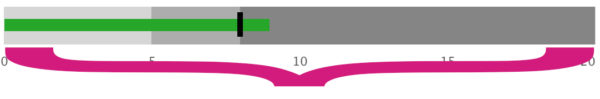
| Yes | Show color ranges. Enables and shows the configuration for Color Ranges |
| No | Do not show color ranges. |
Ranges
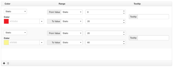
Use ![]() to add a new comparative range definition and
to add a new comparative range definition and ![]() to delete a range from the list.
to delete a range from the list.
Configure a Static or Derived color for each entry. See Color Formatter for more details.
Configure a Static or From Field value for the min and max range.
Optionally add a tooltip that will be shown on mouse hover over the range area.
Step 6: Preview
This step previews the end result based on the choices you made.