edgeCore’s Chart Visualization allows you to select from many different chart types. This base chart type determines what options will be exposed when configuring a series.
| Icon | Chart Type | Polar Support | Multiple Series Render Option |
|---|---|---|---|
 |
Area |  |
|
 |
Area Spline | |
|
 |
Bar | |
|
 |
Bubble | ||
 |
Column | |
|
 |
Line | |
|
 |
Pie | ||
 |
Scatter | ||
 |
Spline |
Chart Configuration
The Chart Visualization configuration is broken out into five steps:
- Base Chart
Identifies the name and base options for the chart. - Dimensions
Configures the X-Axis of the chart, which is normally displayed on the horizontal axis. - Measures
Configures the Y-Axis of the chart, which is normally the vertical axis. - Series
Determines the values plotted on the chart. - Preview
Previews the end result based on the choices you made.
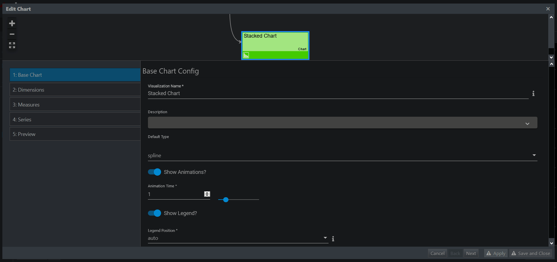
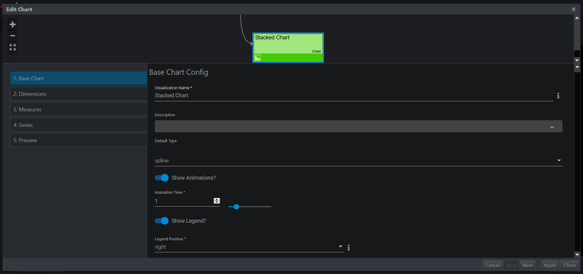
Step 1: Base Chart
- Visualization Name
A symbolic name used to identify this Visualization. This will be the name that appears in the pipeline. - Default Type
This determines a default chart type. This default chart type will enable/disable certain features on the following wizard screens.
Note: You can override chart type per series on most of the available chart types. This allows you to mix different chart types together. The exception is Pie Chart, which restricts each item in the series to a pie slice. - Show Legend?
This determines whether a legend will be shown by default for the chart.
Regardless of the default setting, legends can be toggled on/off at run time via the chart icon in the visualization’s header.
- Render as Polar?
Chart types that support a polar chart option will have a property called “Polar”. The chart types that support polar variants are indicated in the table above.
| Yes | The chart will be rendered as a Polar chart, which uses a radial axis.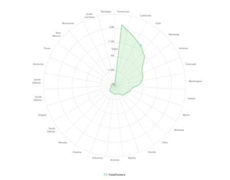 |
| No | The chart will be rendered normally. |
Step 2: Dimensions
A dimension of data typically shows up as the X-Axis on a chart, but it can also appear as the Y-Axis in some cases. An example would be a Column Chart (X-Axis) vs. a Bar Chart (Y-Axis). The header on this step will explain which axis will be affected, according to the chart type that you selected.
- Type
This property determines the type of data used for the Dimension axis. It affects how the tick marks along that axis are plotted.
| category | A Category axis contains STRING values. The tick interval will default to one per category. |
| datetime | A DateTime axis contains DATE values. The tick interval is calculated based on the Date Unit property. |
| linear | A Linear axis contains NUMERIC values and assumes a linear relationship between the values. |
| logarithmic | A Logarithmic axis contains NUMERIC values and assumes a logarithmic relationship between the values. |
- Show Labels
This determines whether to show labels on the Dimension axis.
| Yes | Labels will be displayed along the axis. |
| No | Labels will be hidden. |
- Attribute
This determines the attribute to use for the Dimension axis. The configured Axis Type will limit the options available in the Attribute pull-down. If you do not see a specific attribute name in this pull-down, then the Data Type of that Attribute may not be compatible with the Axis Type selected.
Highcharts error #15: When dealing with a date/time dimension axis, the dataset should be sorted by the attribute used as the dimension axis. For performance reasons, the Chart Visualization does not sort data. It assumes the content creator will pre-sort the data. When unsorted, the Chart Visualization will produce browser console errors similar to the example below: - Title
This property determines whether a title appears along the Dimension axis.
Note: A null value for this property means that no title will be displayed. - Override User Time Zone
This is only applicable to an axis type of DateTime. It allows an administrator to override a user’s localized time zone.
| ON | Displays a Time Zone pull-down. Selecting an explicit Time Zone from this pull-down ensures that all users will see the same times, regardless of where they are physically located. |
| OFF | Date information will be localized and shown using a GMT offset based upon a user’s location. |
- Localized Date?
This is only applicable to an axis type of DateTime. If custom formatting is desired, it can be set globally via a Highcharts adapter.
| No | Default. The axis date label will always be in YYYY-MM-DD format. |
| Yes | Show the axis date label in a localized format based user’s language preference. |
Step 3: Measures
- Title
This property determines whether a title appears along the Measure axis.
Note: A null value for this property means that no title will be displayed. - Type
This property determines the type of data used for the Measure axis. It affects how the tick marks along that axis are plotted.
| category | A Category axis contains STRING values. The tick interval will default to one per category. |
| datetime | A DateTime axis contains DATE values. The tick interval is calculated based on the Date Unit property. |
| linear | A Linear axis contains INTEGER values and assumes a linear relationship between the values. |
| logarithmic | A Logarithmic axis contains INTEGER values and assumes a logarithmic relationship between the values. |
- Starting Value
This is only visible for numerical axis types (Linear and Logarithmic). This sets the minimum starting value on the axis for the chart.
| Static | A fixed number can be specified and data points less than this value will be clipped from view. |
| Automatic | Default setting: automatically calculated based on the dataset. |
| Constraint | Choose a numeric constraint in the system in which its minimum value will be used. Data points less than this value will be clipped from view. This allows you to share a calculated minimum value across different datasets, therefore allowing for comparison between different charts on the same page. Only dynamic constraints should be used. |
- Ending Value
This is only visible for numerical axis types (Linear and Logarithmic). This sets the maximum ending value on the axis for the chart.
| Static | A fixed number can be specified and data points greater than this value will be clipped from view. |
| Automatic | Default setting: automatically calculated based on the dataset. |
| Constraint | Choose a numeric constraint in the system in which its maximum value will be used. Data points greater than this value will be clipped from view. This allows you to share calculated maximum value across different datasets, therefore allowing for comparison between different charts on the same page. Only dynamic constraints should be used. |
- Show Labels?
This determines whether to show labels on the Measure axis.
| Yes | Labels will be displayed along the axis. |
| No | Labels will be hidden. |
- Render Option (Optional)
This property determines how series information is grouped together and presented. (Only Area, Bar, Column, and Areaspline chart types have such an option.)
| Grouped | Groups information for multiple series side by side, allowing for easier comparison of the values within the series. |
| Percentage | Stacks series on top of each other and shows a percentage comparison. |
| Stacked | Stacks series on top of each other, allowing for aggregate comparison across the available Dimension. |
- Allow Decimals?
Applicable only to Linear axis type. This determines how the Measure axis tick values will be presented.
| Yes | Axis tick values might contain decimals. |
| No | Axis tick values will be in integers only. |
Step 4: Series
This step will vary based on what you have selected for the “Dynamic Series” property.
- Dynamic Series?
This option determines has how the series is defined. The choice made here significantly alters the rest of the series configuration.
| Yes | The series will be derived based on the numeric attributes available in the underlying data, and a set of rules configured in the following “Series” step. This is a good option when the attributes available in a data set may change, based on variables used in the underlying queries and scripts. This option allows only limited control over how each item in the series will look. |
| No | The series will contain a static set of attributes that are manually configured on the following “Series” step. This is a good option when attributes are constant and do not change based on underlying queries and scripts. This option allows for greater control over how each item in the series will look. |
Static Series Configuration
Dynamic Series = No |
When Dynamic Series is set to no, this results in a “Static Series”. A static series is good for data sets whose columns stay consistent, and will not vary based upon variables in underlying queries and scripts. Each series lets you explicitly select the attribute (column) you would like to show in your chart, and it gives you total control over how the data for that attribute is presented. Most of the configuration options are oriented around defining how each series will look.
- Attribute Name
The attribute containing the values for this series. - Display Name
Determines how the attribute name will be displayed in the chart. This allows you to rename attributes to something more meaningful to an end-user. - Chart Type Override
Determines the chart type used for each series. Selecting an option different from the base chart type allows you to mix different chart types together. For example, you can overlay a line chart on top of a column chart.
No override is possible when the base chart type is pie. - Renderer
Determines how a chart series will be rendered. The options available will vary based on the selected chart type.
Dynamic Series Configuration
Dynamic Series = Yes |
The dynamic series configuration is good for data sets whose columns change over time or vary based on variable queries. A dynamic series is a flexible approach, allowing the number of series to grow or shrink based on what is in the underlying data. However, what you gain in flexibility you lose in control over presentation.
- Inclusion Method
This lets you limit the numeric attributes used in a dynamic chart. It allows you to filter out attributes like IDs and Zip Codes, things that might show up as INTEGERS, but you would not want to appear in your chart. The options are:
-
-
- All Numeric Columns (Default)
- Columns Contain
- Columns End With
- Columns Start With
-
- Exclusions
Optionally select one or more columns to be specifically excluded from the Visualization. - Color Palette
This lets you choose a base color palette to use with a dynamic series. When using a dynamic series, the series information is not known and can grow and shrink based on what is in the data. Because of this colors cannot be bound to individual attribute names like in statically defined series.
A Dynamic series references a color palette, which is just an array of color values. It will iterate through these colors for each item in the series, moving from left to right in the order that they appear in the preview. If a series is larger than the number of colors in the palette, it will wrap and start reusing colors.
Step 5: Preview
This step provides a preview of the resulting Visualization. It exposes upstream variables to test how inherited context changes will affect the display.
edgeCore 4.3.6 Version
Data Row Limit
Charts are limited to 1,000 data rows.
Adjusting the Position of the Legend
You can select one of the following positions from the Legend Position dropdown: auto, bottom, left, right, and top.
When auto is selected, the position of the legend will depend on the dimensions of the visualization. If the visualization is wider than it is high, the legend will be on the right, and in the opposite case, it will be at the bottom.
Please note that if a legend label is greater than 20%, the label will be shortened and three dots will be added.
Additionally, if you disable the Show Legend toggle switch, the Show legend when maximized toggle will appear. When this toggle is enabled, the legend will be displayed when the visualization is maximized (when you double-click the visualization header). In this case, the legend’s position will be set to auto.
Packed and Split Packed Bubbles
edgeCore version: 4.3.10
If you have a smaller dataset, when creating a chart visualization, you can use the packed bubble chart type where the size and color of the bubbles are used to visualize the data. When using this chart type, you can configure:
- a packed bubble chart that displays data in a cluster of circles
or - a split packed bubble chart grouped by series to create a hierarchy
Creating a Packed Bubble Chart
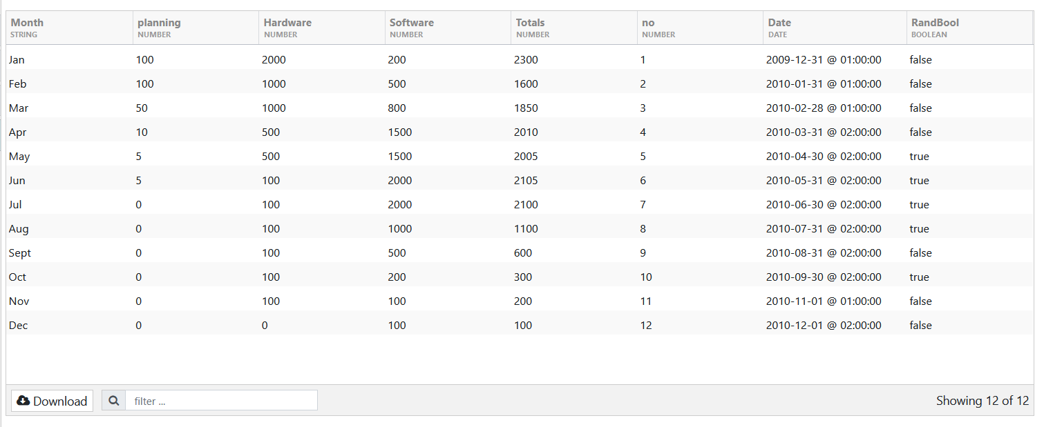
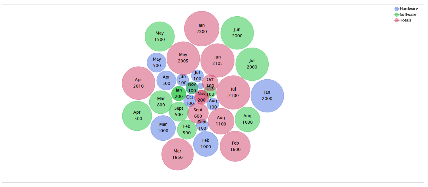
For our example, we will use the CSV feed containing a smaller dataset as seen in the following screenshot:
- Select Chart Visualization from the visualization picker.
- In Base Chart, do the following:
a) In Visualization Name, enter a name for your visualization.
b) In Default Type, select packed bubble.
c) (Optional) Enable the Show Animations toggle switch if you want the packed bubble to display animations.
d) (Optional) Enable or disable the Show Legend toggle switch if you want to see the legend for the packed bubble. If this toggle is enabled, you will need to select the legend position. If the toggle is disabled, you will see an option to show the legend when the visualization is maximized.
e) Leave the Enable grouping by series toggle disabled, as it is used to create a split packed bubble.
f) (Optional) Enable or disable the Show Labels toggle switch, depending on whether you want to see values as labels.
g) (Optional) Provide a title for the packed bubble chart.
h) Click Next.
You are taken to the Dimensions tab, where you choose to show labels for the X Axis. If you enable the Show Labels toggle switch, you will need to select an attribute from your dataset. - In Series, add attributes from the dataset by clicking + or use dynamic series.
For the purpose of this example, we have added the following three attributes (see the screenshot above): Hardware, Software, Totals. - Click Next to go to Preview, where the result is displayed.
We enabled showing legend and labels, and since we have chosen Hardware, Software and Totals attributes from our dataset, in the output, we see the following:
– a legend with the above-mentioned attributes
– values of those attributes shown as labels
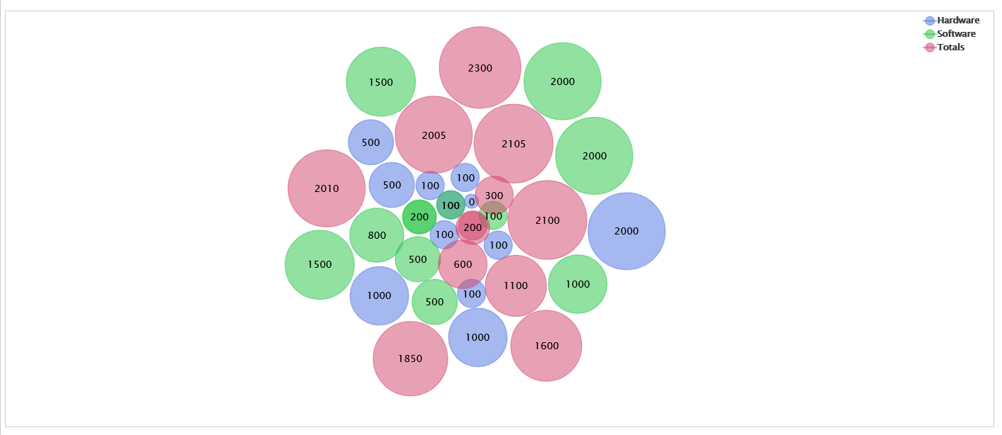
In Dimensions, we did not enable labels. However, if we wanted to do so, we would have selected the Month attribute from our dataset as a label, so that the name of the month is displayed as a label for the above-mentioned attributes (Hardware, Software, Totals).
- Click Save and Close.
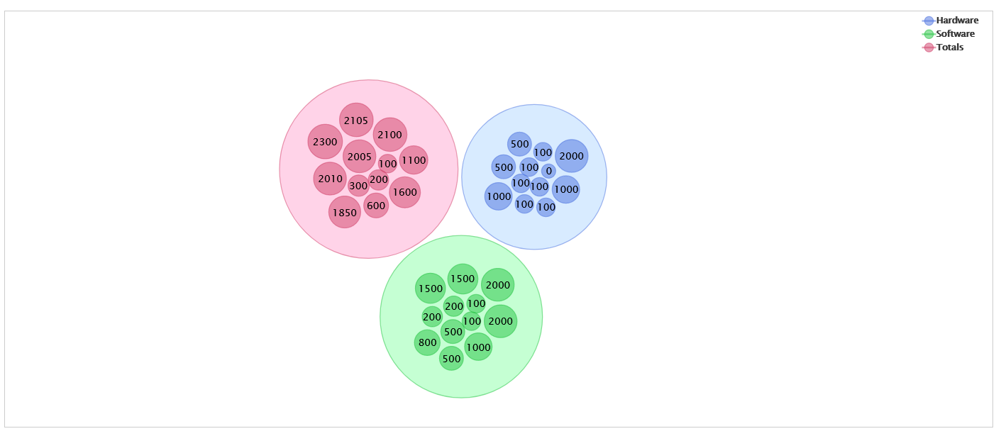
Creating a Split Packed Bubble Chart
To create a split packed bubble chart, follow the same steps outlined above, but turn on the Enable grouping by series toggle switch (step 2e).
The final result should look like this:
Series Type
edgeCore version: 4.4.1
In Series, you can choose between three types: mixed, single, and dynamic.
When mixed type is selected, the first attribute requires chart type override.
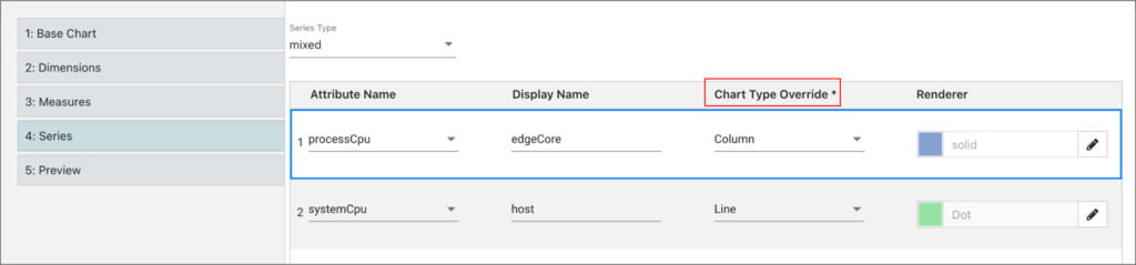
When single type is selected, the override field is disabled.
Moreover, if pie is the default type, you can choose between single and dynamic series (mixed type will not be available).
Also, if bubble is selected in override, you will need to define a radius in the bubble renderer.
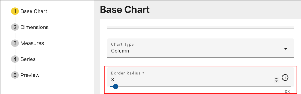
edgeCore 4.5.1 Version
Charts like bar, column, and pie support rounded corners. To specify the radius value in pixels, use the Border Radius setting. The default value is 3 pixels.