The region_summary data transform that you created earlier contains a dynamic query of the original states data. You will use this to produce a pie chart visualization.
Perform the following steps to create the pie chart visualization:
- Click
 and from the filter drop-down, select region_summary to view only this in the pipeline.
 - Click the gear icon button in the region_summary transform box.
- Select +, and then New Visualization.
A pop-up for choosing a visualization is displayed. - In the pop-up, select Chart.
A new page is displayed. - On the Base Chart tab, do the following:
a) In Visualization Name, enter Sales Regions.
b) For Default Type, select pie.
c) Disable the Show Legend toggle switch.
d) Click Next.
You are taken to the Dimensions tab. - On the Dimensions tab, do the following:
a) For Attribute, select Year.
b) Click Next.
You are taken to the Measures tab. - On the Measures tab, do the following:
a) In Inner Radius, enter 70%.
b) Click Next.
You are taken to the Series tab. - On the Series tab, do the following:
a) Enable the Dynamic Series toggle switch. New fields are displayed.
b) In Inclusion Method, select All Numeric Columns in order for all four regions to be automatically displayed in the pie chart.
c) Click Next.
You are taken to the Preview tab where you can observe the pie chart showing the percentage of total sales by region. - Click Save and Close.
The Sales Region pie chart visualization is displayed in the pipeline.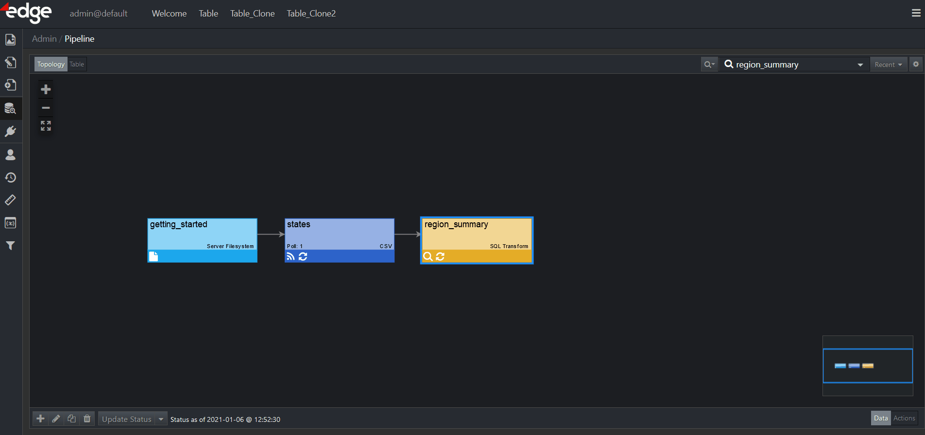
For more information on Visualizations, refer to the corresponding chapter.
Additionally, if you want to learn about custom visualizations, you may do so here.