Icon Renderers can be used with any data type. They are used to represent values in data as graphical elements.
User Interface
The Icon Renderer received a fairly large update in version edgeCore:
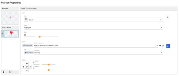
- The Icon Renderer now universally supports “layers”. This allows several different icons to be composited together, with each layer being determined by a different ruleset. The result is a very powerful way of graphically summarizing multiple layers of status.
- The Icon Renderer now supports a preview, making working with offsets for different layers much easier to visualize.
Selecting a Static Icon
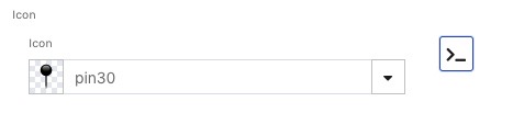
Selecting an icon is done via the custom input field. Clicking anywhere within the Icon input field will open the “Icon Picker”.
Selecting a Derived Icon
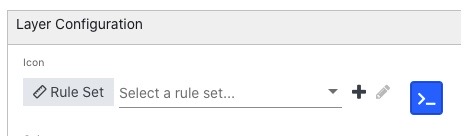
The “Derived” option provides a different set of inputs from a static icon. Instead of selecting an individual icon from the icon picker, users will select a “Rule Set” that contains a collection of icons mapped to specific values in the data.
- A list of variables will appear below the Rule Set.
- The number of variables will vary based on the complexity of the rules within the Rule Set.
- Each variable needs to be mapped to an attribute that contains values needed to satisfy the logic within the Rule Set. This mapping allows Rule Sets to be reused across different datasets, regardless of what raw attribute names are.
- The attributes available for each variable will be limited by data type (STRING, NUMBER, etc.), ensuring that values supplied to the ruleset are valid.
Clicking on >_ you can add a derived icon. When >_ appears blue, that means it is selected.
Icon Style
Icons shipped with edgeCore are based on SVG source, but due to performance reasons, edgeCore does not display SVG icons in the product. Instead, the edgeCore server generates a raster image from the SVG source based on the sizes defined in Rule Sets and Renderers. This is done so that the raster icon can be “cached” by the browser. This hybrid approach lets edgeCore scale images up and down without losing image fidelity, but such that the browser is still able to cache the raster image and gain a noticeable performance improvement with dense data visualizations, such as topology.
Because the stock icons are SVG, edgeCore is able to expose several options in the “Style” property that affects how the SVG image will be rendered.
| Style | Example | Description |
|---|---|---|
| Flat |  |
The SVG will only have a color fill applied. This is the default option and is available for all SVG based icons. |
| Highlight |  |
The highlight is a specialized style that combines a flat colored fill with a “Highlight” layer. It is only available on a small subset of icons and primarily used to enable a “shine” effect on simple shapes. The “highlight” layer is white to the transparent gradient that sits on top of the “Fill” layer within the SVG. This means the “highlight” layer will work with any colored fill that is applied. Highlight layers are available for icons in the following groups: Shapes, Map, and Status. |
| Outline |  |
The SVG will only have a color stroke applied, providing an outline of the image. The fill area will be transparent. |
Override Ruleset Size
Size information is stored within a Rule Set. This allows the sizes of icons to vary based on values in the data. While this is convenient, it also limits reuse. The “Size” option in the renderer is essentially an override that lets you ignore the sizes from a RuleSet, and specify a new static size to use with a renderer. For example, a ruleset with small icons, that was set up with a Table Visualization in mind, can be made larger for use in a List Visualization.
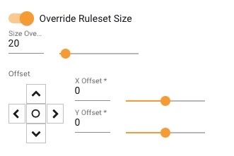
Override Ruleset Size
- Yes – Sizes contained within rules will be ignored. A Static “Size Override” will be enabled, and applied to all icons in the Rule Set.
- No – Size information will come from rules within the Rule Set.
Size Override
- MIN – 0 Pixels
- MAX – 256 Pixels
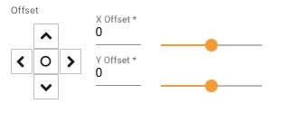
Offset
Offset affects the position of the icon on a selected layer. This control is useful when overlaying different icons. It is often used in conjunction with size variations across different layers to create overlays. An example would be positioning a small status overlay at the top right corner of a resource icon.