A List Visualization summarizes individual records as either a vertical or horizontal list. It is geared towards displaying a small number of attributes, intended to summarize a record. Lists often rely on hover actions to reveal additional information about a record in a tooltip or dialog.
List Configuration
List configuration is broken out into four steps:
- Base List
Sets overall layout and general padding. - List Items
Determines the data that will appear in each list item, and the renderer that will be used for that data. - Sort Option
Determines the default sort for the list. - Preview
Shows a preview of the configured list.
Step 1: Base List
This step sets the overall layout for the list, and exposes some options for padding.
Visualization Name
A symbolic name used to represent this Visualization. This is the name that will show up in choosers when adding a Visualization to a page.
List Orientation
Determines the orientation of the list.
| Flow | Flow layout produces a horizontal list. List items will have a set width, and flow left to right. List items will wrap to the next line if needed.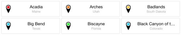 |
| Vertical | Vertical layout produces a vertical list. This list will render a single record per row, and each row will fill 100% of the available space.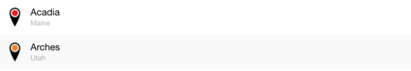 |
Item Background Color
Determines the background color of each item.
Padding
Adjusts the spacing inside of a list item. Padding affects inner white-space, the gap between values in a list item and the border of the list item.
Margin
This property is available with Lists using “flow” orientation. Margin affects outer white-space, the gap between one list item and an adjacent list item. Margin will increase the gap between the border of one list item and the adjacent items.
Width
This property is available with “flow” orientation. It sets a pixel width for each list item, which determines how many items can fit on a row.
Auto-expand
This property is available with “Flow” orientation. It works in conjunction with Width, and determines whether list items should grow to fill any remaining space. This option basically turns the Width property into a Min-Width property.When using flow layout with auto-expand enabled, a list item’s width will grow to fill available space until there is enough room for another minimum width list item to appear. When that happens, a new list item will appear on the row, increasing the number of items on that row. All list items will then snap back to their configured widths and will grow as needed until there is room for another item.
Step 2: List Items
This step configures the attributes to display as part of each list item. It also defines the renderer to use when presenting the values for the specified attributes.
Attribute Name
Determines the record values that will appear in each list item.
Label
Label acts as a description for values that appear in a list. The Label defaults to the Attribute Name, but can be overwritten with something better optimized for display.
Show Label
This property determines whether a label will appear next to a value within a list item.
| Yes | A label will be shown to the left of the value. |
| No | Only the value will be shown. |
Value Renderer
Determines the renderer to use with the associated attribute. The value renderer determines how record values for each attribute are presented. The available renderers will vary based on the data type of the each attribute.
- Icon
- Number
- Text
- Date
See “Renderers” for more information.
Label Formatter
Determines how labels will appear inside list items. The label formatter is a global setting, and will be used for all labels within the List.
The default font used is Roboto.
Color
Determines the color of labels. See Color Picker
Size
Determines the font size of labels.
| Min | 6 |
| Max | 256 |
Style
Determines the font style of labels.
| Normal | Sample |
| Italic | Sample |
| Bold | Sample |
| Bold Italic | Sample |
Step 3: Sort Options
This step configures how the list items are sorted.
Attribute
Select an attribute from the underlying dataset, whose values will be used to determine the sort.
Order
Controls how the values will be sorted.
| Ascending | A → Z |
| Descending | Z → A |
Step 4: Preview
This step previews the end result based on the choices you made.
Related page: Multiple Selection