edgeCore version: 4.4.1
3D charts are used to create three-dimensional charts and as such provide an interesting visual effect. However, 3D charts may be more difficult to read than standard charts depending on the amount of data you have.
NOTE: The following chart types cannot be shown in 3D:
- Line
- Spline
Example
We have a CSV file containing web browser market shares for three months, which we have uploaded to edgeCore.

After uploading the file to edgeCore, we are going to create a chart visualization and show the CSV data in 3D.
To enable 3D, we need to turn on the Show Chart in 3D toggle switch in the Base Chart tab. As mentioned above, line and spline cannot be shown in 3D, so if you have selected one of these chart types, the toggle to enable 3D will not be displayed.
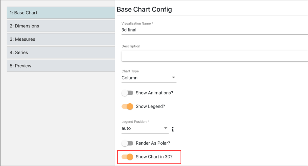
NOTE: If the Render as Polar option is enabled, you will not be able to show the chart in 3D.
In Dimensions, we have selected datetime for the Y-axis, and for Series, we opted for dynamic. This is what our 3D chart looks like:
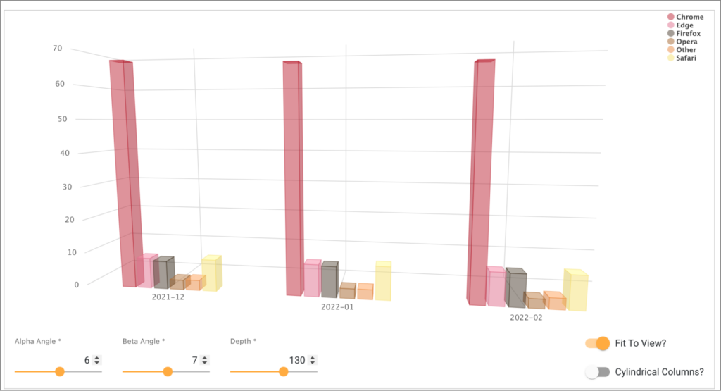
As seen in the screenshot, in the Preview tab, additional settings are available for the 3D chart:
| Settings | Description |
| Alpha Angle | The angles to rotate the view of the chart. |
| Beta Angle | |
| Depth | The total depth of the chart, defaults to 200. |
| Fit To View | Enabled by default to zoom your view to a distance which will center the whole chart and make it fully visible. |
| Cylindrical Columns | A variation of a column chart that features cylindrical points. |
Moreover, you can rotate the 3D chart to inspect points from different angles by dragging the chart with the mouse.