edgeCore enables you to create a wide variety of visualizations:
- Animated Text
Displays text data with animated transitions, and as such are often used to highlight key messages, create visual interest, and convey data in a more interactive manner. For more information, refer to this page.
- Bullet Chart
Displays performance against a target. It combines a bar chart with a reference line and additional markers to provide a clear and comprehensive view of progress toward goals. Bullet charts are particularly useful for dashboards and performance tracking. For more information, refer to this page.
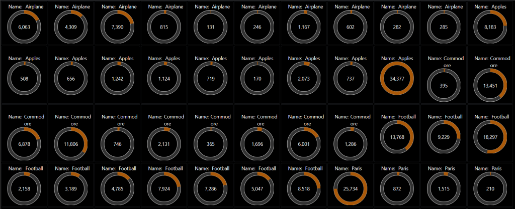
- Chart
Reveals patterns and trends that might be less apparent in tabular data. For more information, refer to this page.
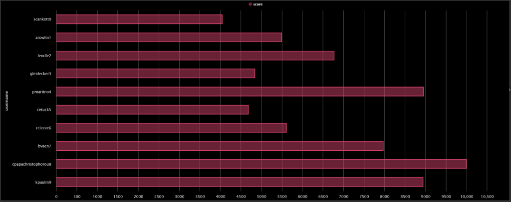
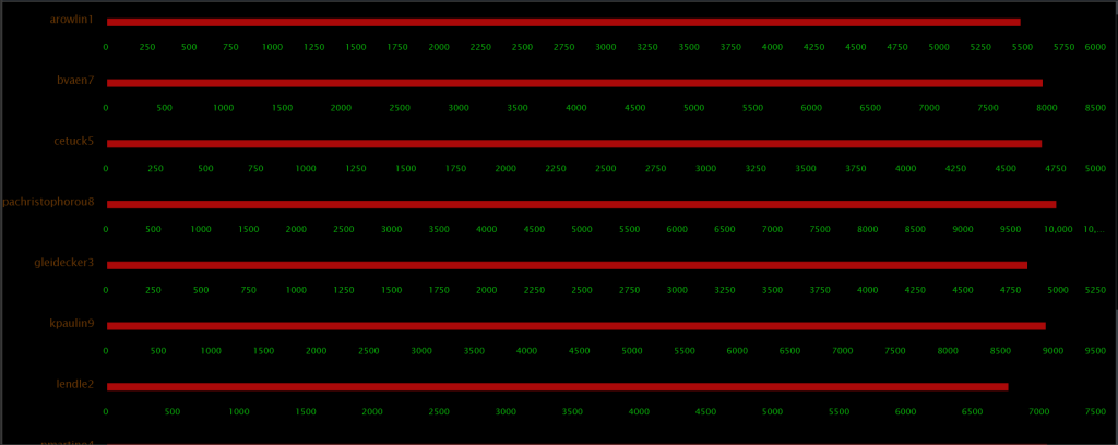
edgeCore offers a number of chart types:
– Bar Chart: shows comparisons between categories using rectangular bars.
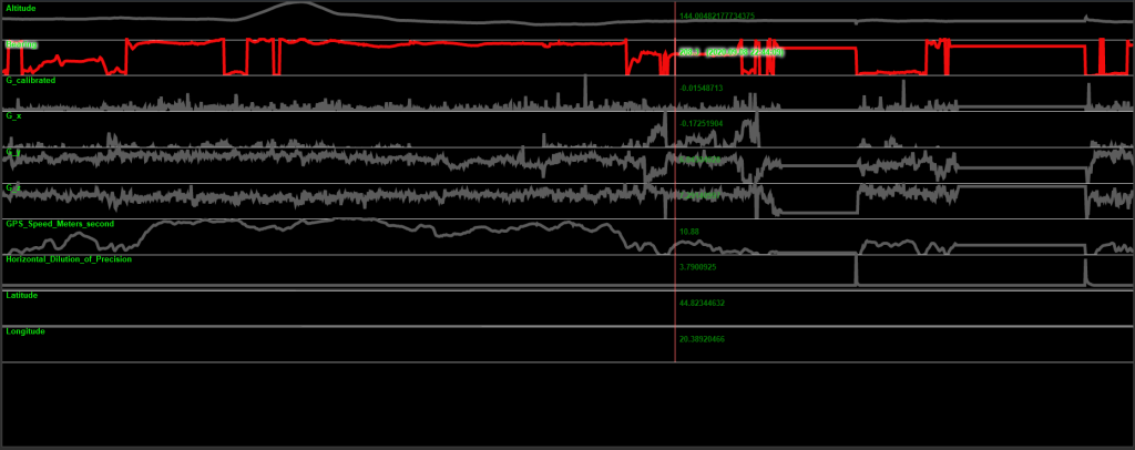
– Line Chart: shows trends or continuous data over time. It consists of a series of data points connected by straight lines, making it ideal for showing changes and patterns.
– Pie Chart: illustrates numerical proportions with slices. Each slice represents how a category contributes to the whole. Pie charts are useful for showing percentage shares or relative proportions of a dataset.
– Area Chart: similar to line charts but with the area below the line filled in to emphasize volume.
– Area Spline: involves plotting data in a way that illustrates how values change over a range, often with shaded areas under the curve to emphasize the magnitude of these values. This type of visualization is particularly useful for showing cumulative data or for highlighting the area between two curves.
– Bubble: displays three dimensions of data and is essentially a scatter plot where each data point is represented as a bubble. The position of each bubble on the x and y axes represents two variables, and the size of the bubble represents a third variable.
– Column: displays data in vertical bars, making it easy to compare values across categories. Each column represents a category, and its height corresponds to the category’s value.
– Packed Bubble: bubbles are arranged to fill a specified area while representing three dimensions of data: two dimensions for position (x and y coordinates) and one for size. It’s particularly useful for visualizing data with a hierarchical or spatial structure and can handle a large number of data points effectively.
– Scatter: displays the relationship between two quantitative variables. Each point on the chart represents an observation, with its position determined by two variables, often revealing patterns, correlations, or outliers.
– Spline: data points are connected by smooth curves rather than straight lines. This creates a smoother, more visually appealing representation of trends and patterns in your data. It is useful for viewing data trends over time. - Flow Diagram
Illustrates the sequence of steps or processes. It helps to show how various elements interact and flow from one to another, making it easier to understand complex processes and workflows. For more information, refer to this page.
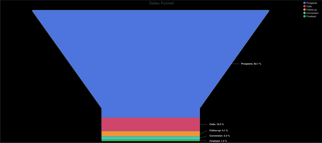
- Funnel Chart
Shows the progressive reduction of data as it passes through different stages of a process. It is often used in sales and marketing. For more information, refer to this page.
- Gauge
Displays a single value relative to a scale. It is commonly used to illustrate performance metrics, progress toward goals, or current status in a visually intuitive way. For more information, refer to this page.
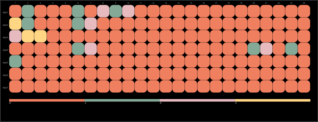
- Heat Map
Uses color to represent data values in a matrix or grid. For more information, refer to this page.
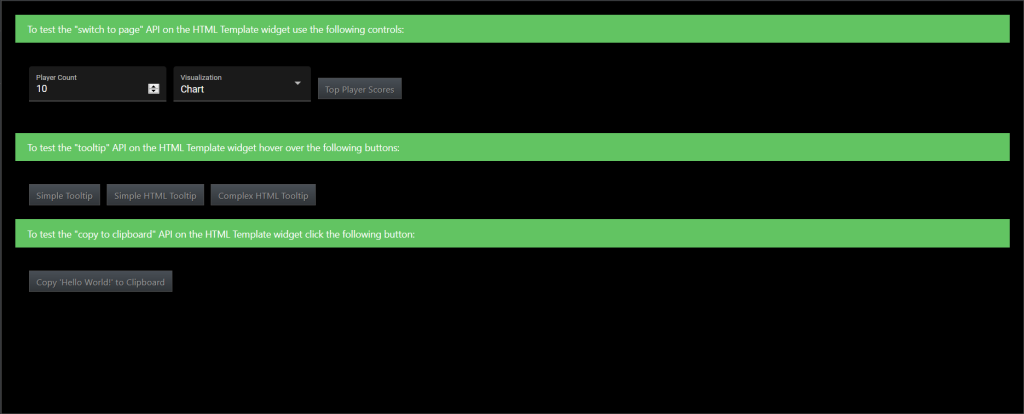
- HTML Template
Presents data in graphical or visual formats using HTML, CSS, and JavaScript. For more information, refer to this page.
- List
Represents data or information in a list format. For more information, refer to this page.
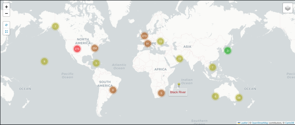
- Map: Icons
Uses icons on a map to represent different types of information or data points. For more information, refer to this page.
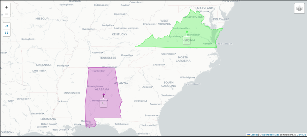
- Map: Regions
Displays and analyzes data across different geographic areas or administrative boundaries on a map. For more information, refer to this page.
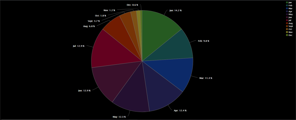
- Pie Chart
Illustrates numerical proportions with slices. Each slice represents how a category contributes to the whole. Pie charts are useful for showing percentage shares or relative proportions of a dataset. For more information, refer to this page.
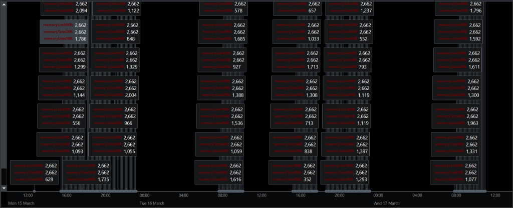
- Small Multiples
Displays a series of similar charts or graphs side by side to allow for easy comparison across different categories, time periods, or segments. Each individual chart in the series, known as a “small multiple,” uses the same scale, axis labels, and design principles, which helps in making direct comparisons between the various data subsets. For more information, refer to this page.
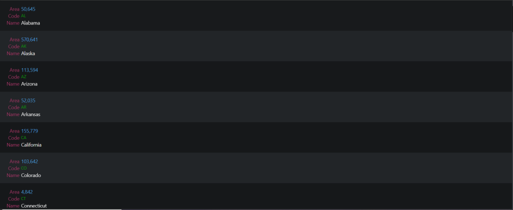
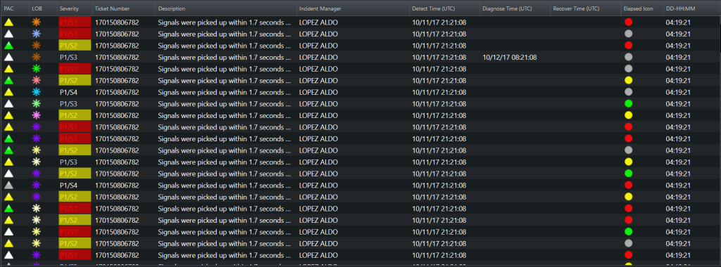
- Table
Presents data in a structured grid format, where data is organized into rows and columns. This approach is particularly useful for displaying detailed information where precise values and comparisons between different data points are important. For more information, refer to this page.
- Timeline
Displays events or data points along a chronological axis to show the progression and relationships over time. Timelines are particularly useful for illustrating historical events, project milestones, schedules, or trends, and they can be used to provide context and understanding of how events unfold over a period. For more information, refer to this page.
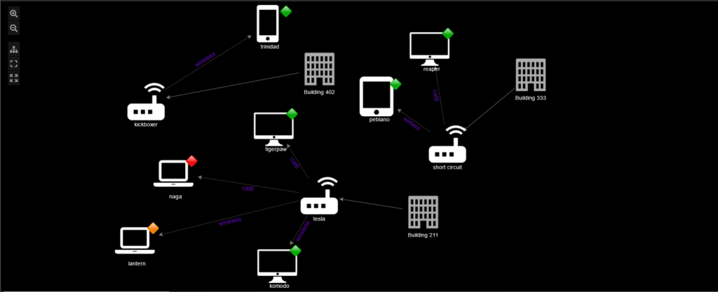
- Topology
Represents the structure and relationships of a network or system based on its topological properties. This type of visualization helps in understanding how different components are connected and how they interact within a given space or structure. Topology visualizations are crucial in various fields, including computer networks, social networks, biological systems, and geographical mapping. For more information, refer to this page.
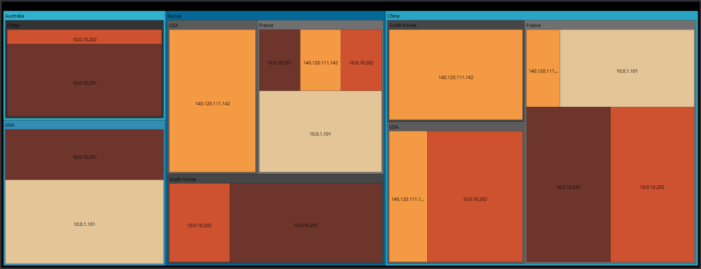
- TreeMap Diagram
Displays hierarchical data in a compact, space-efficient manner. It uses nested rectangles to represent different levels of the hierarchy, where the size and color of each rectangle convey information about the data. For more information, refer to this page.