Visualization Types
The following visualization types are available in edgeCore:
- Animated Text
- Bullet Chart
- Chart
- Flow Diagram
- Gauge
- Heat Map
- HTML Template
- List
- Map: Icons
- Map: Regions
- Pie Chart
- Small Multiples
- Table
- Timeline
- Topology
- TreeMap
- Custom
Creating and Adding Visualizations to a Page
For practical examples of how to create visualizations and add them to a page, refer to this section.
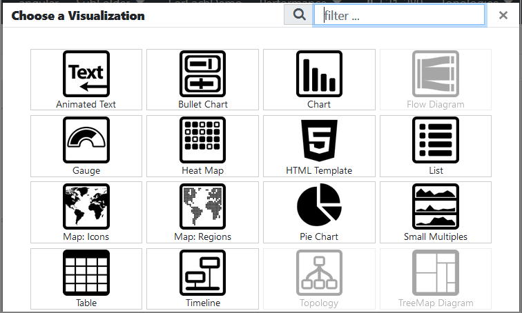
Visualization Picker
By default, visualizations are represented by icons.
If you want visualizations to be represented by images, go to Admin tools > System Config > Scope USER and add the following key: client.showVisChooserIcons (introduced in version 4.3.11).
In this case, the value of the key needs to be false. After adding the key, when you go back to the pipeline to create a new visualization, you will see images in the picker.
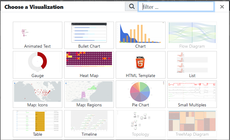
In version 4.4.1, after adding client.showVisChooserIcons and setting its value to false in Admin tools > System Config, you need to refresh the browser for the change to be applied.
Note: If a Visualization is grey and can not be selected, that means the selected dataset does not have a compatible data structure for that Visualization type. The dataset must be transformed so its data structure is compatible with what the Visualization expects. This typically means a tabular data structure needs to be transformed into a relational model (refer to relational models in the Transforms chapter).
Admin Visualization Menu
When in the Edit mode, the administrator can access a list of actions for the associated visualization by clicking the three dots.
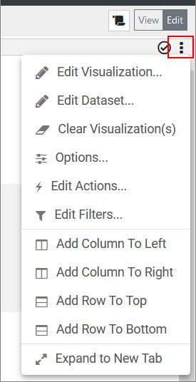
The following actions are available:
| Icon | Action | Description |
|---|---|---|
 |
Edit Visualization | Launches a dialog with the visualization’s configuration and allows you to make adjustments. Changes made here will affect visualizations on other pages. |
 |
Clear Visualization | Clears a visualization but maintains the space. This action will result in an empty visualization. |
 |
Options | Options expose various properties for the visualization instance. From here, you can: alter the visualization’s label, allow end-users to download the underlying data set, provide help text for end-users, configure stacked visualizations, and customize the visualization’s container appearance. |
 |
Edit Actions | Launches the Manage Actions dialog, which allows you to add interactivity to a visualization. This does not apply to Web Content Visualizations. |
 |
Edit Filters | Launches the Manage Client Filters dialog, which allows you to add client-side data filtering to a visualization. This does not apply to Web Content, Topology, TreeMap Diagram, and Flow Diagram Visualizations. |
 |
Download Data Set | Downloads a CSV file, containing the dataset being displayed by the associated visualization. This does not apply to Web Content, Topology, TreeMap Diagram, and Flow Diagram Visualizations. |
 |
Expand | Expands the visualization so that it takes up the full screen. When expanded, this icon will disappear, and it will be replaced with the Compress icon. |
|
Expand To New Tab | Expands the visualization to a new browser tab/window without any edgeCore navigation controls. |
 |
Restore | This icon only appears when a visualization has been expanded and fills the whole screen. Clicking this icon will compress the visualization back to its original size. |
 |
Refresh | Reloads the visualization. This will only appear if the administrator has turned on the edgeCore property: client.visualization.menu.showRefresh=true |
 |
Help | Only available if a help text has been set in the visualization’s options (see section Visualization Options). It will display help text in a dialog. |
 |
Table Columns | Only available for Table Visualizations. It will allow the user to control what columns to show/hide. |
 |
Toggle Chart Legend | Only available for Chart Visualizations. It will allow the user to toggle the chart’s legend on or off. |
Additionally, several layout-related actions are also available. These options allow for more complex layouts on the page.
| Icon | Action | Description |
|---|---|---|
 |
Swap | Allows you to change the positions of two visualizations on the page. By clicking the Swap action on a target visualization, a “swap mode” is activated. The next click will identify a visualization to swap with. To swap, Click the header of a different visualization, and the two visualizations will swap positions on the page. To cancel, simply select the header of the current visualization. |
 |
Remove | Removes a visualization from the page. The remaining visualizations will expand to reclaim the available space. |
 |
Add Row To The Bottom | Splits the current visualization in half horizontally, inserting an empty visualization above the existing visualization. Use the Swap action to reposition visualizations. |
|
Add Row To Top | Splits the current visualization in half horizontally, inserting an empty visualization below the existing visualization. Use the Swap action to reposition visualizations. |
 |
Add Column To Left | Splits the current visualization in half vertically, inserting an empty visualization to the left of the existing visualization. Use the Swap action to reposition visualizations. |
|
Add Column To Right | Splits the current visualization in half vertically, inserting an empty visualization to the right of the existing visualization. Use the Swap action to reposition visualizations. |
Visualization Options
To access Visualization Options, click the three dots and then Options. The following options are available:
| Options | Description |
|---|---|
| Visualization Label | This property allows the administrator to change the name of the visualization instance on the current page. This will not affect visualizations on other pages. Moreover, variables can be inserted into visualization labels by using a {pageVar.Name} syntax in the text field. Example: “{pageVar.NationalParks} National Park” will resolve to the value of the associated Page Variable at that time. Thus, if the ‘NationalParks’ Page Variable is set to “Arches”, then the Visualization label would read “Arches National Park”. |
| Visualization | Displays the name of the visualization being used by the current visualization instance. |
| Dataset | Displays the name of the dataset being used by the current visualization. It is intended to be a reference for the Visualization Label. This is displayed on the left side of the screen as well. |
| Customize No Data Message | Determines if the default No Data To Display should be overwritten or not. When enabled, the custom No Data message will apply to this visualization instance. When disabled, the default system-wide No Data To Display message will be displayed. |
| Message | Allows the administrator to change the No Data message of the visualization instance on the current page. This will not affect visualizations on other pages. See the Visualization Label option above on how to add a Page Variable to the message. |
| Allow Users To Download Dataset? | Allows all users to download datasets for any visualization on a page. This does not apply to Web Content, Topology, TreeMap Diagram, and Flow Diagram Visualizations. |
| Visualization State Persistence |
Specifies how a visualization state (the modifications you make) is persisted. a) Always: the state will be saved to server preferences; b) Session: the state will be saved only to the client; c) None: the state will reset on each page visit; |
| Restrict help to this page instance? | Determines the scope of the help message: When enabled, the help message will only apply to the instance of this visualization on the current page. When disabled, this help message will apply to all instances of this visualization. |
| Default/Instance Help | A text area where the administrator can provide an HTML-based help message for a visualization. Typing in this field will result in a question mark appearing in the Visualization’s header. End-users will be able to access help via this icon. Leaving this field blank will hide the question mark icon. |
For more information on the stacking mode, refer to the corresponding page.
Visualization Container Appearance
The administrator can adjust each visualization container’s appearance in the Container Type dropdown. This setting only affects the visualization in the View mode.
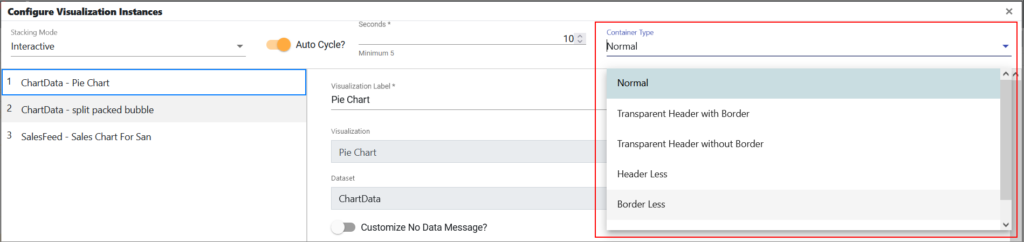
The following appearance types are supported:
- Normal – Default with full header and border.
- Transparent Header with Border – The background of the header will be transparent and there will be a border around the visualization.
- Transparent Header without Border – The background of the header will be transparent and without any border around the visualization.
- Header Less – The header will not be shown.
- Border Less – The border will not be shown.
- Header & Border Less – The header will not be shown and no border will be rendered around the visualization.