The stand-alone Pie Chart Visualization is a pivoted version of the “Pie” Chart available through the standard charting component. The difference between the two options is the data structure that is expected by the Visualization.
Data Structure
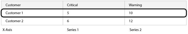
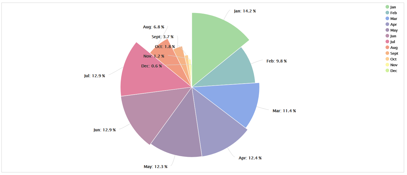
The Chart Visualization expects series information to appear as attributes, individual columns within the data. Thus, the “Pie” Chart option in the Chart Visualization will show attributes (columns) as pie slices:
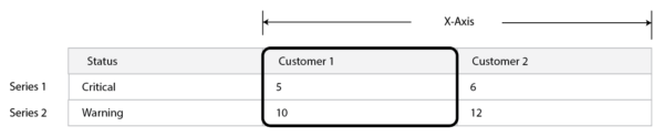
The stand-alone Pie Chart Visualization, however, expects series information to be rows of data, instead of columns. It will render individual rows as pie slices. This approach is desirable when showing tooltips. Since tooltips are based on rows of data as well, when data is structured in this way, the tooltips are able to show more useful information contained in other attributes.
Pie Chart Configuration
- Base Pie Chart
- Series
- Options
- Preview
Step1: Base PieChart
- Visualization Name
Name used to identify this Visualization. - Name Attribute
An attribute that contains values to use for series names. Each record value for this attribute will appear as the label for a pie slice. - Value Attribute
An attribute that contains values that determine the size of each pie slice. Each record value for this attribute will be used to determine how large the pie slice is. - Title
An optional text input used to enter a title for the Pie Chart.
- The value entered will be displayed above the pie chart.
- If title is blank, then no title will appear.
Step 2: Series
- Dynamic Series
The Dynamic Series option determines how pie slices are calculated.
| Yes | Generate the series of pie slices automatically based on the records in the data set. |
| No | Select the specific series attributes to display as pie slices and individually configure the properties of each attribute. |
- Dynamic Series Configuration
A dynamic series means that pie slices will be automatically generated base on the unique values specified in the Name Attribute in the previous step.
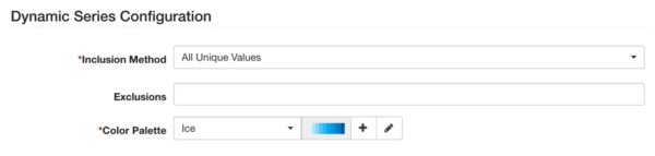
- Inclusion Method
The inclusion method provides different options for limiting records. It acts as a filter, reducing the number of pie slices that will appear in the pie chart. Options are:
– All Unique Values
– Values Contain
– Values End With
– Values Start With
- Exclusions
This control will show the unique values in the data, at that time. It allows an administrator to specify values that should be excluded from the end visualization. For example, assume a dataset that contains days of the week. The exclusion property can be used to exclude weekends so that the pie chart visualization only shows Mon – Fri.
- Color Palette
For a dynamic series, the exact number of slices will not be known at design time. The slices will vary based on the records in the dataset at that time. The color palette property defines a set of colors to use for the pie chart. The Pie Chart will loop through the available colors in the palette, starting over if it runs out. - Static Series Configuration
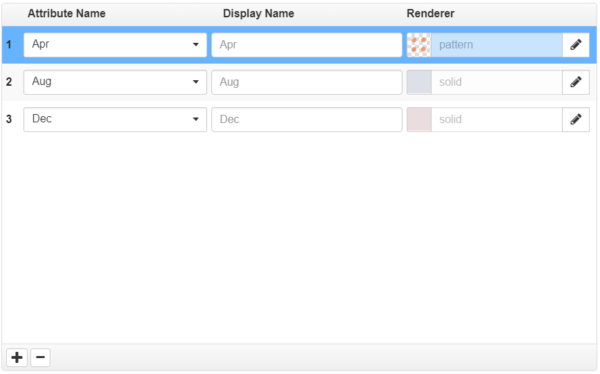
A static series allows an administrator to manually configure pie slices for the end visualization. The Static option builds up the list of values to show.
A Static Series allows more control over the color of specific pies slices. Instead of iterating through a palette of colors, Static lets you bind an explicit color to an explicit set of values. You can order the series to rearrange the pie slices.
Step 3: Options
A set of options affecting the presentation of the Pie Chart.
- Show Legend
Determines whether or not a legend is shown below the chart, mapping the colors to the associated attributes.
| Yes | A legend will be shown at the bottom of the pie chart |
| No | The legend will be hidden. |
- Inner Radius
Defines an inner radius, allowing the pie chart to be rendered like a donut chart. You can enter a number two ways:
| Pixels | 70 |
| Percentage | 70% |
- Show Label?
Determines whether to show labels for the individual pie slices. Labels are shown as connectors (callouts) pointing to each associated pie slice. When labels are disabled, it is recommended that tooltips be enabled so end users can make sense of what is being shown. - Label Distance
Enabled when show label is set toYes. This determines the distance of the label from the Pie Chart’s outer border.
– Negative numbers put the label on top of the pie slices.
– Connectors are only shown for labels outside the pie.
– The default is 30.
- Show Zero Value?
Determines whether values equal to zero appear in the pie chart.
| Yes | Zero values are included. |
| No | Zero values are ignored and do not appear in the pie chart. |
Step 4: Preview
Provides a preview of the resulting Visualization.
edgeCore 4.3.6 Version
Data Row Limit
Charts are limited to 1,000 data rows.
Adjusting the Position of the Legend
You can select one of the following positions from the Legend Position dropdown: auto, bottom, left, right, and top.
When auto is selected, the position of the legend will depend on the dimensions of the visualization. If the visualization is wider than it is high, the legend will be on the right, and in the opposite case, it will be at the bottom.
Additionally, you can use the Label max width option to set the maximum label width so that the width of large labels can be reduced. By default, the maximum width is 150 pixels.
edgeCore 4.3.9 Version
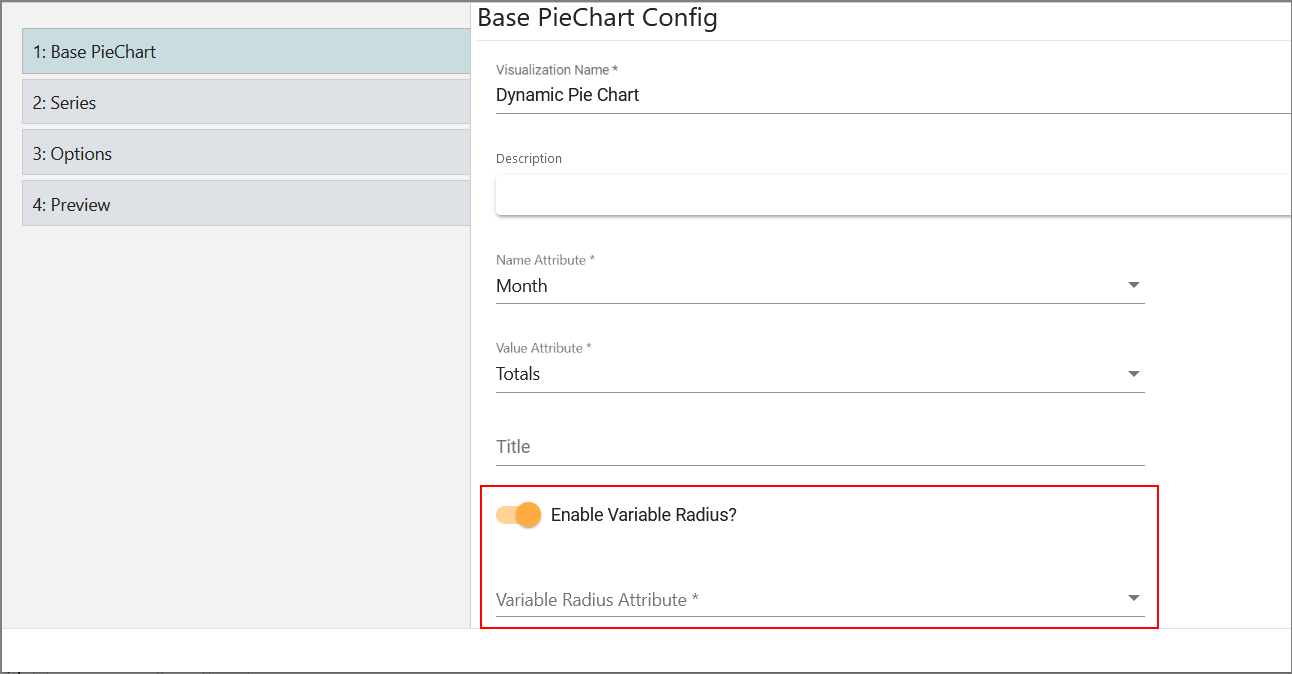
When configuring a pie chart in Base PieChart, you can turn on the Enable Variable Radius toggle switch to visualize the second dimension in the pie chart.
Once you turn on the toggle switch, an additional option will be displayed so that you can select the attribute that will be used.
The final result in Preview will look like this:
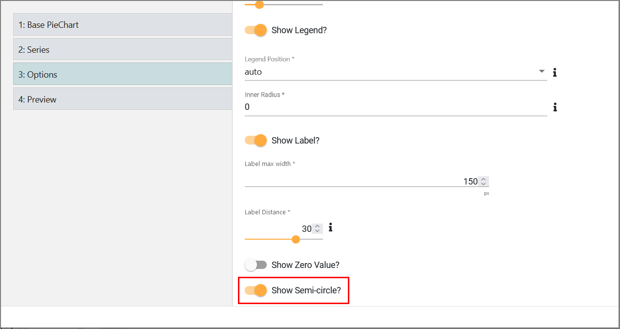
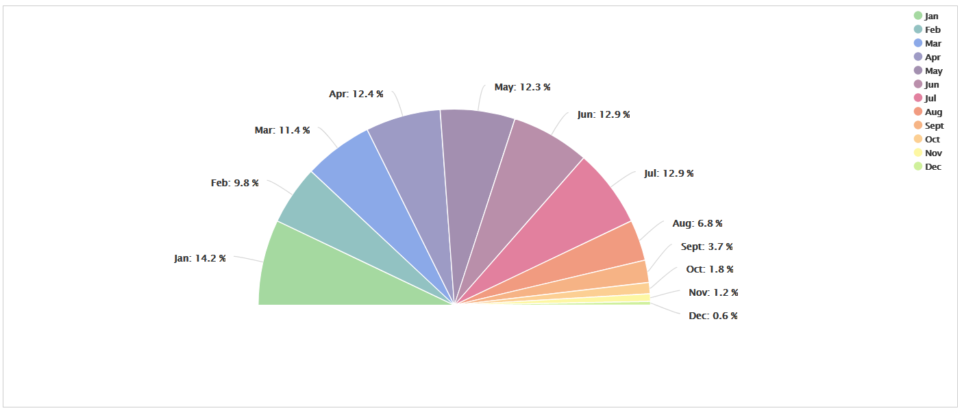
Displaying Semi-circle
When configuring a pie chart in Options, you can turn on the
The final result in Preview will look like this:
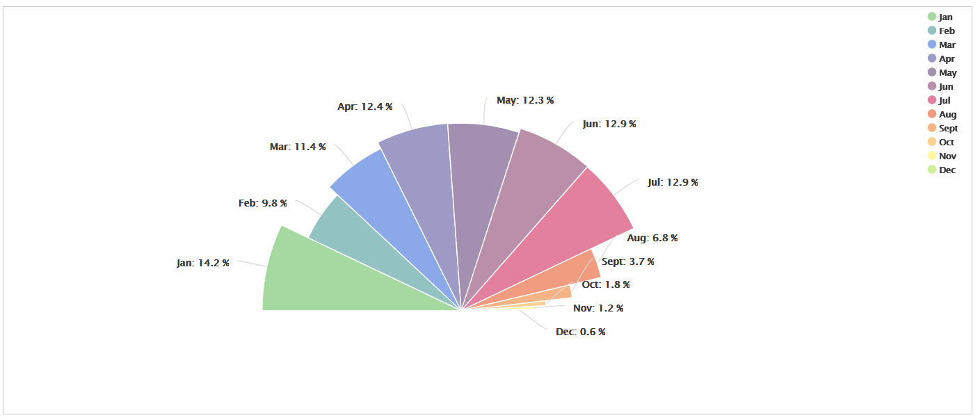
If both variable radius and semi-circle are enabled, the final result will look like this:
edgeCore 4.5.1 Version
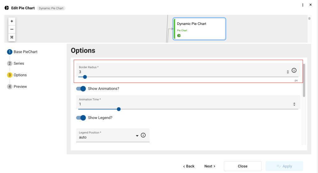
Pie chart supports rounded corners. To specify the radius value in pixels, use the Border Radius setting. The default value is 3 pixels.