edgeCore version: 4.3.10
Note: ResizeObserver API, which is used for micro charts, was introduced in Firefox version 69, so this feature is incompatible with older Firefox versions.
Overview
Micro charts are condensed charts that provide a visual representation of data and can be used to show trends in your data (for example, increases or decreases, economic cycles) or to highlight maximum and minimum values in a different color.
Things to consider:
- Micro charts can be used in table and list visualizations.
- The JSON parser takes a string array, for example, “[15,37,5,34,0,9,-11,14,44,-1]”
The following chart types are supported in both table and list visualizations:
– Area
– Area Spline
– Column
– Line
– Pie
Example: Configuring a Micro Chart inside a Table Visualization
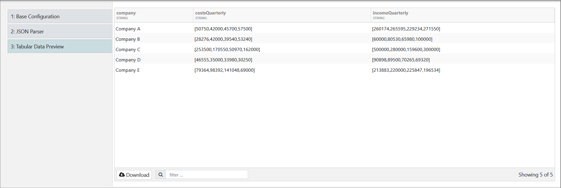
In our example, we want to use micro charts in a table visualization to visualize the quarterly income and costs of several companies. The data (income and costs) are in a JSON file which we will upload.
Step 1: Create a Server Filesystem Connection
Step 2: Create a JSON feed off of the Filesystem Connection and Upload the JSON File Containing the Data
JSON example:
[
   {
      "incomeQuarterly":"[260174,265595,229234,271550]",
      "company":"Company A",
      "costsQuarterly":"[50750,42000,45700,57500]"
   },
   {
      "incomeQuarterly":"[60000,80530,65980,100000]",
      "company":"Company B",
      "costsQuarterly":"[28276,42000,39540,53240]"
   },
   {
      "incomeQuarterly":"[500000,280000,159600,300000]",
      "company":"Company C",
      "costsQuarterly":"[253500,170550,50970,162000]"
   },
   {
      "incomeQuarterly":"[90898,89500,70265,69320]",
      "company":"Company D",
      "costsQuarterly":"[46555,35000,33980,30250]"
   },
   {
      "incomeQuarterly":"[213883,220000,225847,196534]",
      "company":"Company E",
      "costsQuarterly":"[79364,98392,141048,69000]"
   }
]
Our JSON feed data preview looks like this:
Step 3: Create a Table Visualization
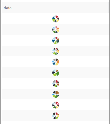
When configuring a table in Column Renderers, we are going to select Micro Chart as a cell renderer for the Income and Costs columns.
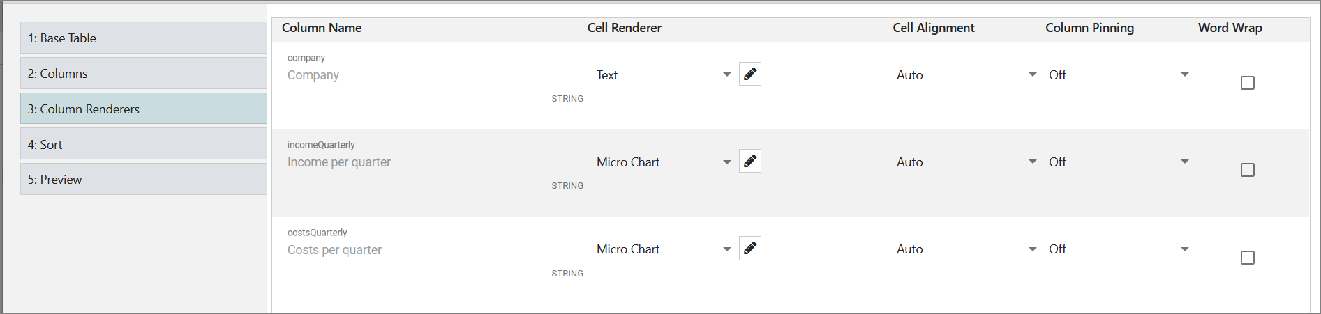
We want the micro charts to be different, for example, for the Income column we want to use a pie chart, and for the Costs column, we want a line.
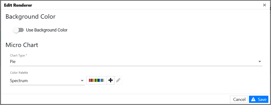
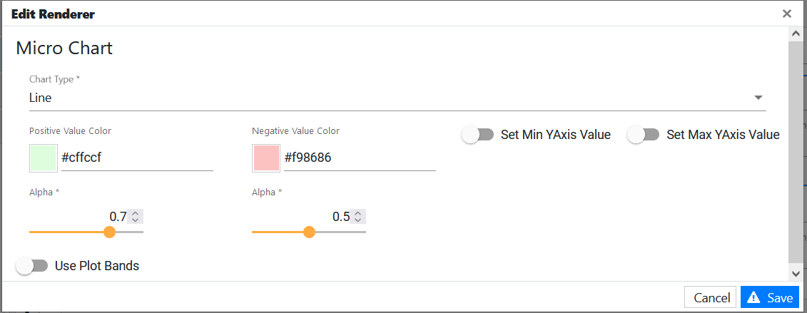
To modify the micro chart for the Income column, we need to click the pencil icon. In the pop-up for editing a micro chart, we will select a Pie chart type, choose a color palette, and save the changes.
To use a line chart for the Costs column, after clicking the pencil icon we are going to select a Line chart type and save our changes.
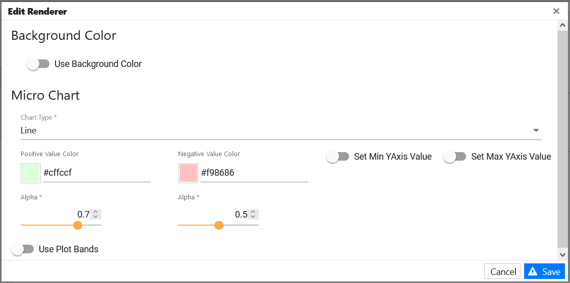
As mentioned above, the following chart types are supported: Are, Area Spline, Column, Line, and Pie. For all of them, except the pie, you can configure additional options.
For these chart types, you can:
– Set colors for both the positive and negative values
– Set minimum and maximum values for an axis
– Use/add plot bands to provide a visual display of status for the series data
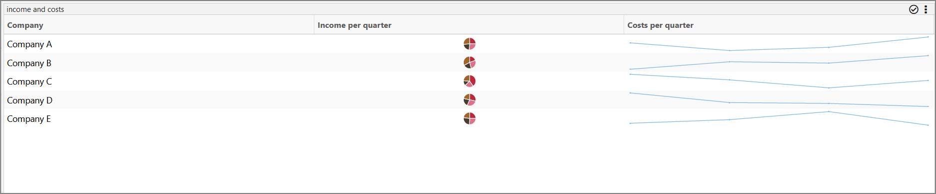
This is the end result where we have a micro pie chart and a micro line chart in a table visualization:
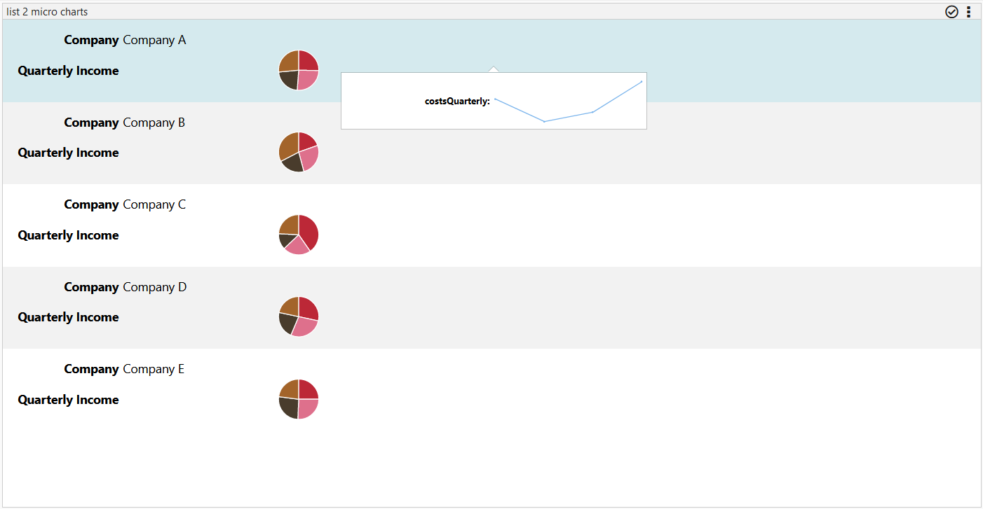
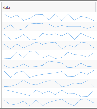
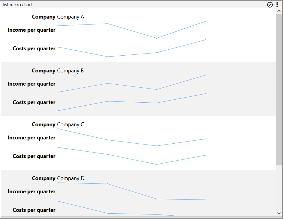
Example: Configuring a Micro Chart inside a List Visualization
We are going to use the same data as above, but in this case, we are going to create a List visualization for the JSON feed.
If you have created the table visualization by following the example above, you can just start creating a list visualization off of the already created JSON feed. If, however, you did not follow the above example/did not want to create a table visualization, go back to steps 1 and 2 above, as they will be used for creating a list.
When configuring a list in List Items, we are going to add all 3 attributes: company, income, and costs.
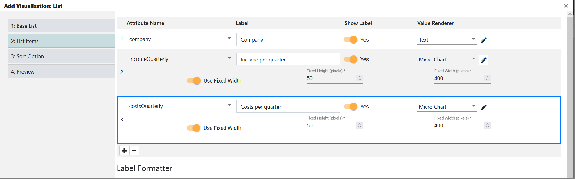
For both income and costs, we are going to select Micro Chart in Value Renderer and set a fixed width. We want to use a line chart for both income and costs, so we are going to edit both micro charts by clicking the pencil icon and then select the line chart type.
As mentioned above in the table example, when editing the micro chart renderer, you can configure additional options.
For Area, Area Spline, Column, and Line chart type, you can:
– Set colors for both the positive and negative values
– Set minimum and maximum values for an axis
– Use/add plot bands to provide a visual display of status for the series data
This is the end result where we have two micro line charts in a list visualization:
Micro Chart in a Tooltip Action
You can also use a micro chart in a tooltip action. Make sure that the visualization for which you are creating the action was made of data parsed as a string array, as previously mentioned above (for example, “[15,37,5,34,0,9,-11,14,44,-1]”).
- Go to the Edit mode.
- Click the three dots in the upper-right corner of the header and then select Edit Actions.
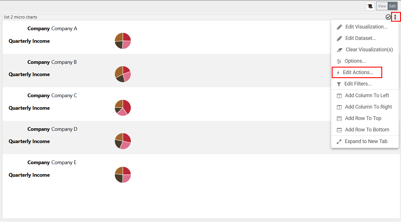
A pop-up is displayed. - In the pop-up, click + and then select Hover > Tooltip.
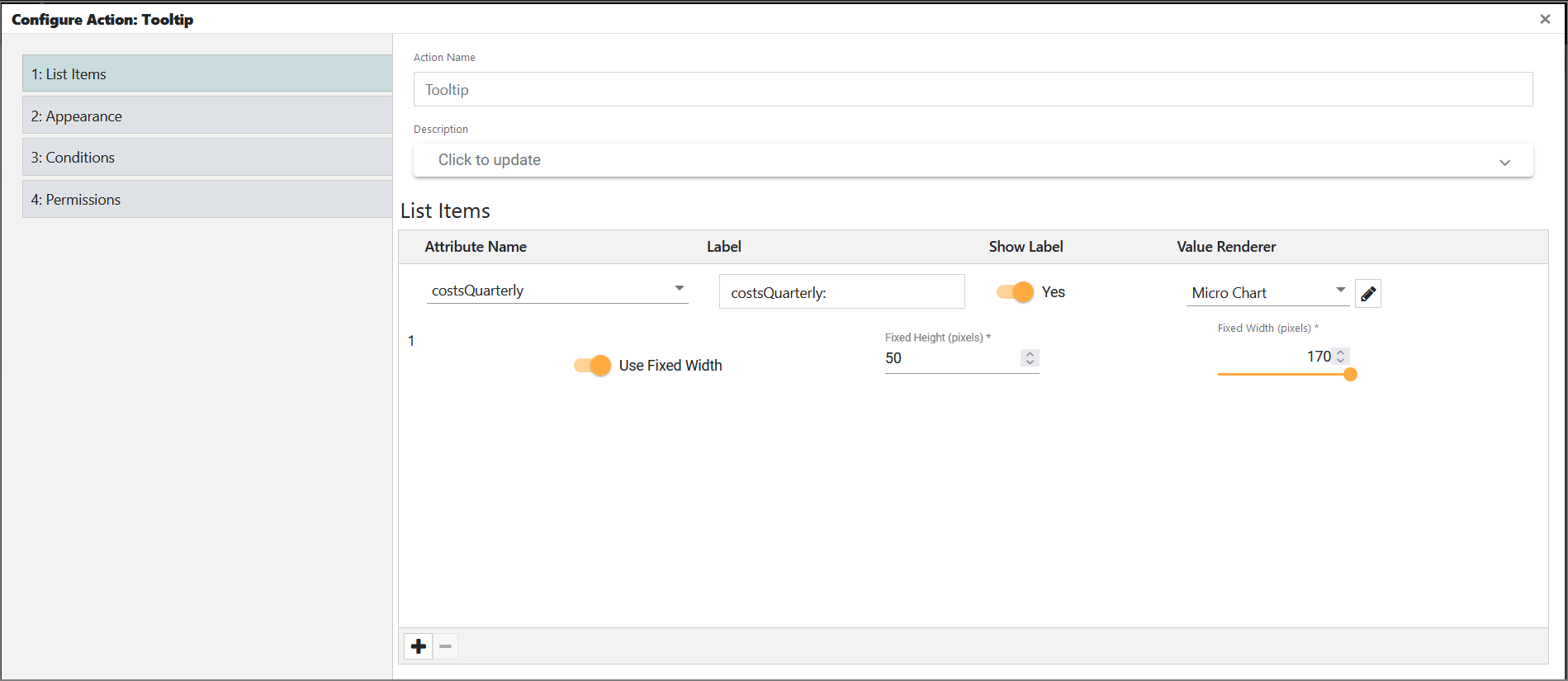
A new page is displayed. - In List Items, do the following:
a) Add one or more attributes (type string, as previously mentioned above) by clicking + in the bottom-left corner.
b) Enable or disable the Show Label toggle switch depending on whether you want the label to be shown in the tooltip. Also, in the Label field, you can change the name of the label, as by default it uses the attribute name.
c) In Value Renderer, select Micro Chart.
d) If you want to edit the Micro Chart renderer (for example, you want to use the line chart type), click the pencil icon next to it and modify the renderer as seen in the examples above.
e) If you want to use fixed width, enable the corresponding toggle switch and then set the desired width. The maximum width is 170 pixels. Also, you can modify the height.
f) Click Next. - Configure appearance, conditions, and permissions as you see fit.
- Click Save and Close.
The created tooltip action is displayed in the pop-up. Close the pop-up and hover over an item in your visualization to see the micro chart.