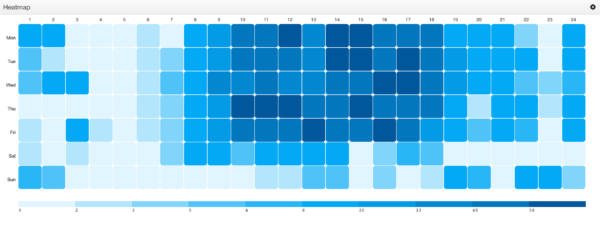
Display data in the form of a matrix in which values are represented as colors.
Data Structure
The Heat Map Visualization requires data to be structured as a matrix. It expects X-Axis and Y-Axis values to appear as Attributes within the data. See example below:
| Hour (X-Axis) |
Day (Y-Axis) |
Value (Heat) |
|---|---|---|
| 1 | Mon | 16 |
| 2 | Mon | 20 |
| 3 | Mon | 0 |
Heat Map Configuration
The Heat Map Visualization configuration is broken out into three steps:
- Configure
Identifies the name and some baseline properties of the visualization. - Renderer
Determines colors for the Heat Map. - Preview
Previews the end result based on the choices you made.
Step 1: Configure
Configuring a Heat Map involves mapping attribute names to the appropriate axis of the Visualization.
Name
Name of the Visualization.
X-Axis Column
Attribute used for the X-Axis of the Heat Map (horizontal axis).
Show X-Axis Labels
Determines whether to show labels for the X-Axis (horizontal axis).
| Yes | X-Axis labels will be shown at the top of the Visualization |
| No | X-Axis labels are hidden. |
Y-Axis Column
Attribute used for the Y-Axis of the Heat Map (vertical axis).
Show Y-Axis Labels
Determines whether to show labels for the Y-Axis (vertical axis).
| Yes | Y-Axis labels will be shown on the left hand side of the Visualization |
| No | Y-Axis labels are hidden. |
Y-Axis Label Width
Width allotted for the Y-axis label.
| Min | 30 |
| Max | None |
Step 2: Renderer
The Heat Map’s renderer conveys the concept of heat. The larger the value, the warmer the temperature.
Derived Thresholds
Determines how “heat” is calculated.
| Auto generate from a palette | Generates a dynamic ruleset based on colors available in a color palette. The number of threshold colors in the Heat Map will equal the number of colors in the color palette. |
| Generate from a ruleset | Uses an explicit Rule Set to determine heat. |
Values Column
Select an attribute to determine “heat” (intensity) of the cells. It must be an attribute with numeric values.
Color Palette
This property will appear when Derived Thresholds is set to false. The color palette will determine the granularity of the Heat Map. For example, if a color palette has 10 colors, then the Heat Map will calculate 10 threshold values. All 10 colors from the color palette will appear in the Heat Map’s legend.
See Color Palettes for more information.
Corner Radius
Determines the corner radius of each cell in the grid. The values are specified as a percentage.
| 0 | Square |  |
| 25 | Rounded Squares |  |
| 50 | Circles |  |
Step 3: Preview
Provides a preview of the resulting Visualization.