edgeCore version: 4.3.10
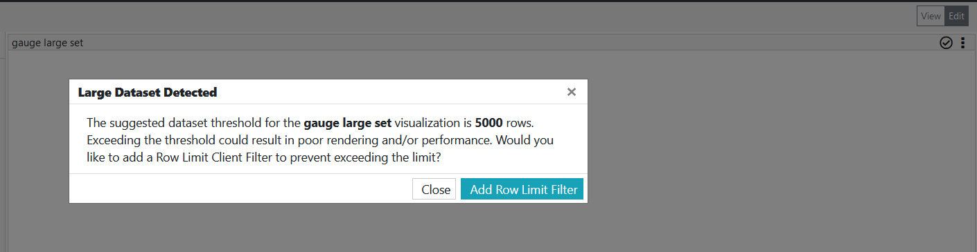
If the number of rows being sent to the visualization exceeds the configured dataset threshold, you will be informed about the suggested threshold and given an option to limit the data by adding a row limit client filter, which will be automatically added to the visualization on your behalf.
The following is a list of visualizations that have a dataset threshold:
- Chart (Threshold = 2000 rows)
- Gauge (Threshold = 5000 rows)
- Bullet (Threshold = 5000 rows)
- Pie Chart (Threshold = 1000 rows)
- Timeline (Threshold = 500 rows)
- Heat Map (Threshold = 200 rows)
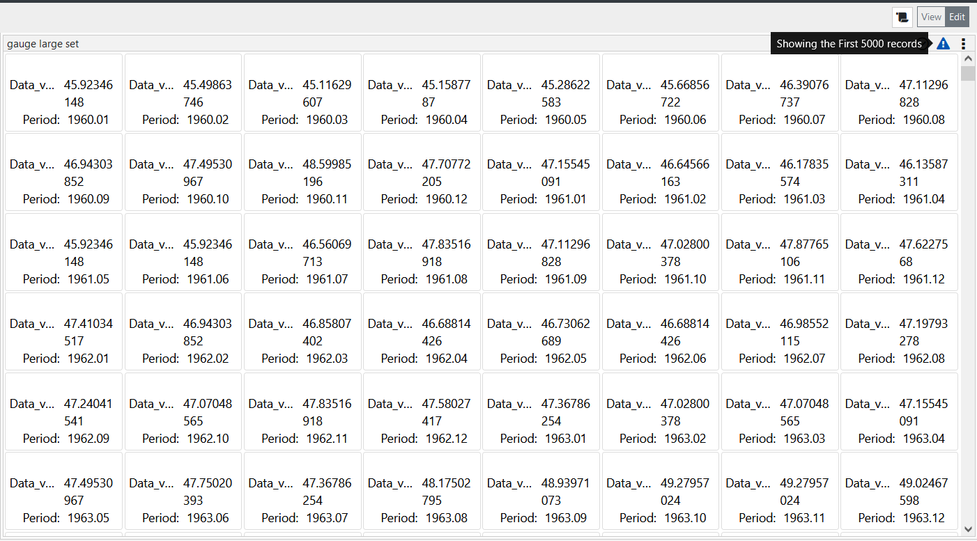
For example, you have created a feed containing 10000 rows, and you start creating a gauge visualization. When you add this visualization to a page, a pop-up will notify you that the suggested threshold for the gauge visualization is 5000 rows. To prevent exceeding this limit, you can click the Add Row Limit Filter button. Upon clicking the button, the client filter will be automatically added to the visualization, and a warning sign will be displayed in the top-right corner. When you hover over the warning sign, you will be informed that 5000 records (the suggested threshold) are shown.